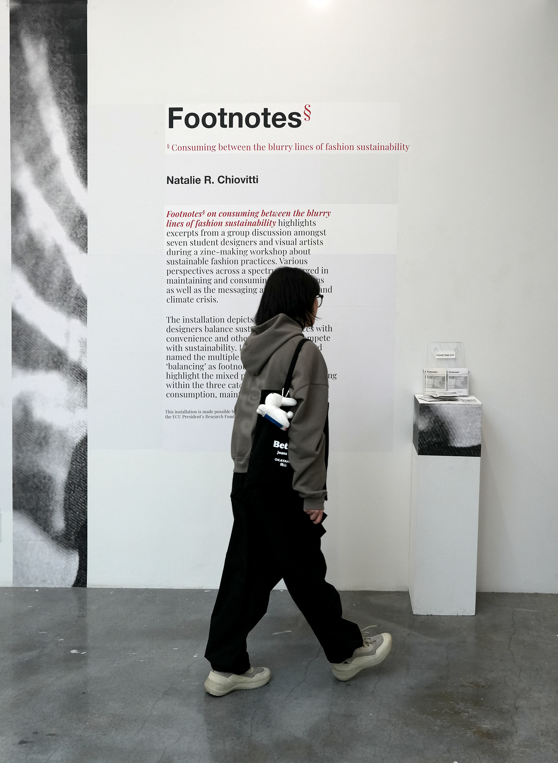
Footnotes* on consuming between the blurry lines of fashion sustainability
Deliverables: Zine-making workshops and text-based installation comprised of typography inkjet-printed on 384 sheets of 100% recycled paper, wheat pasted and tiled onto a wall, measuring 10 x 40 ft.
Tools: Adobe Illustrator and InDesign
Project Type: Graduate thesis project
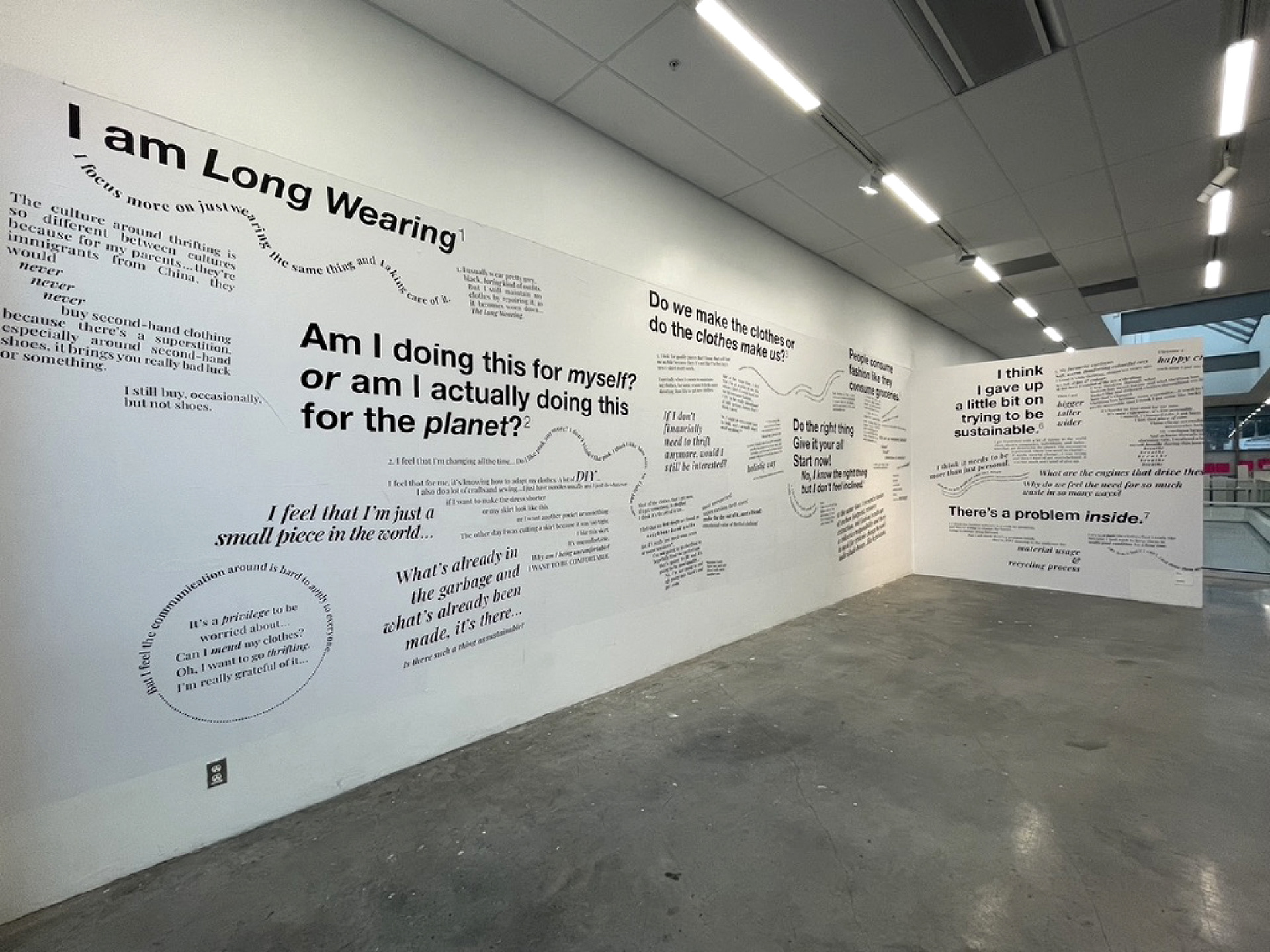
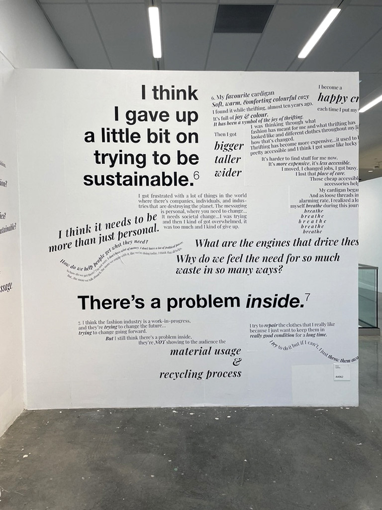
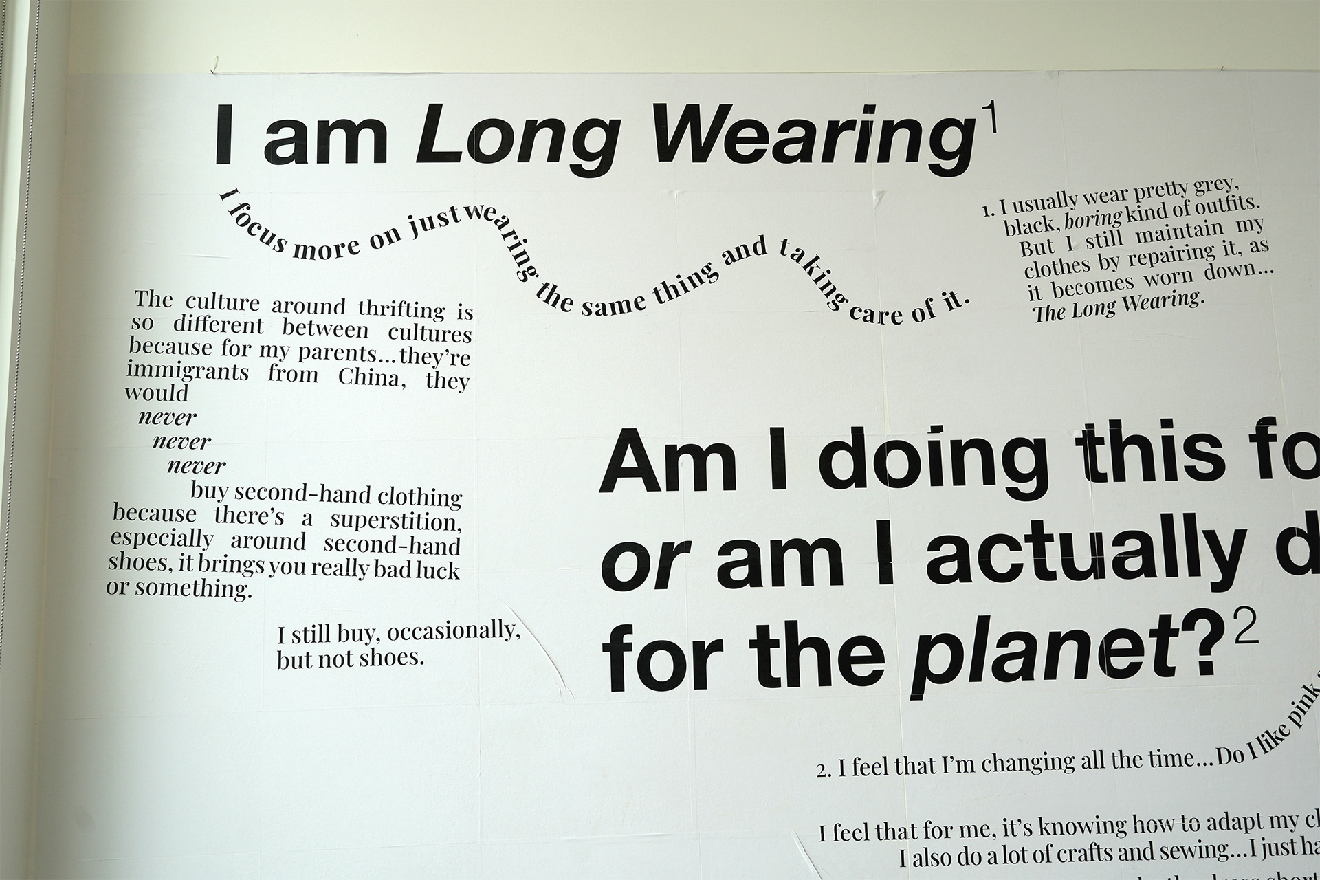
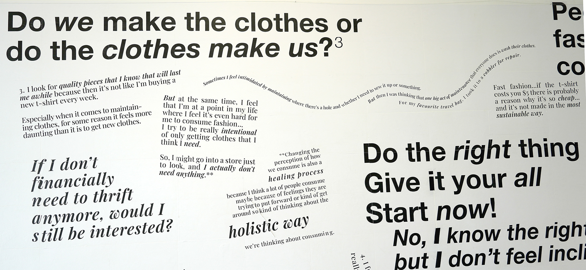
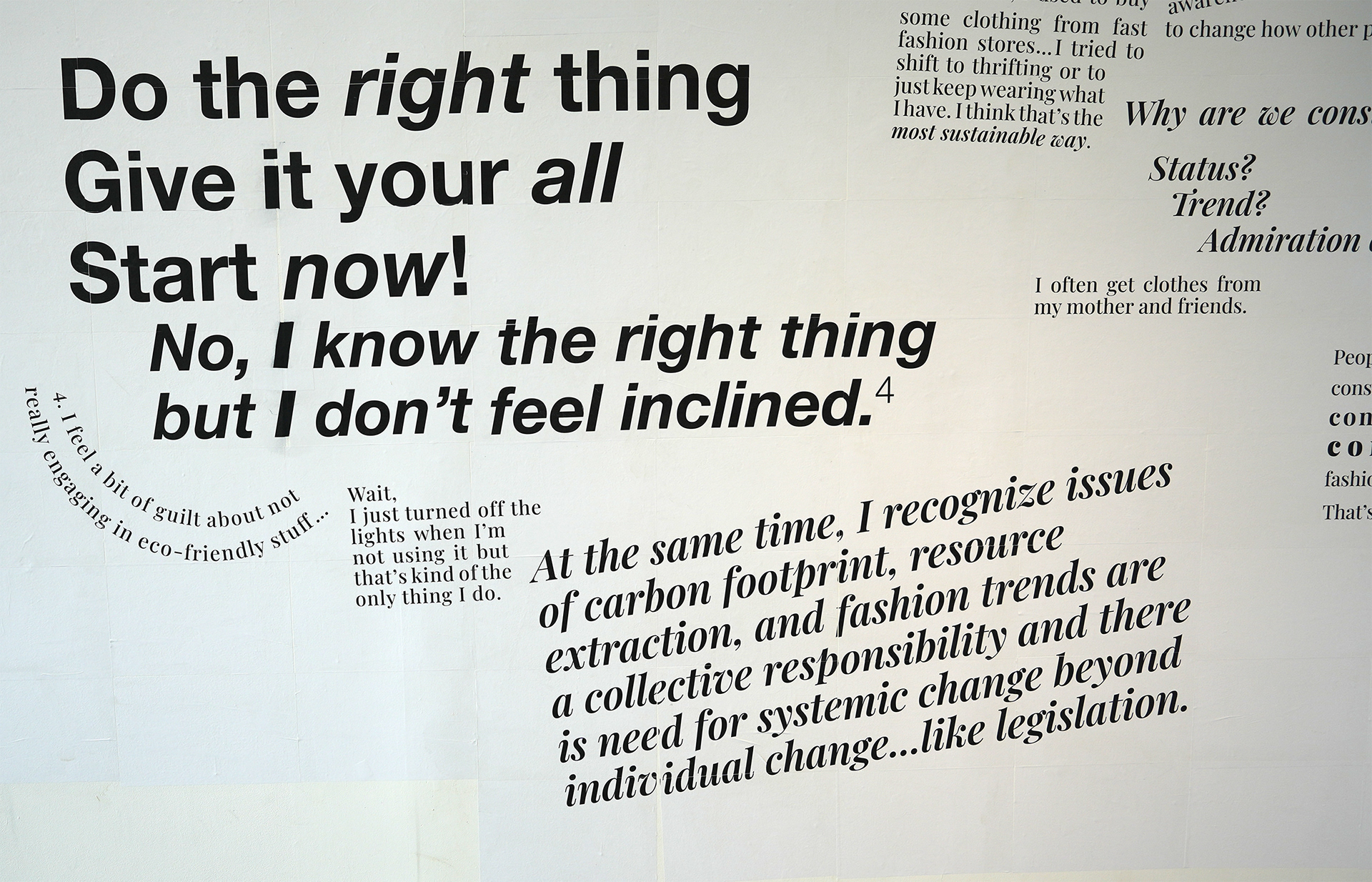
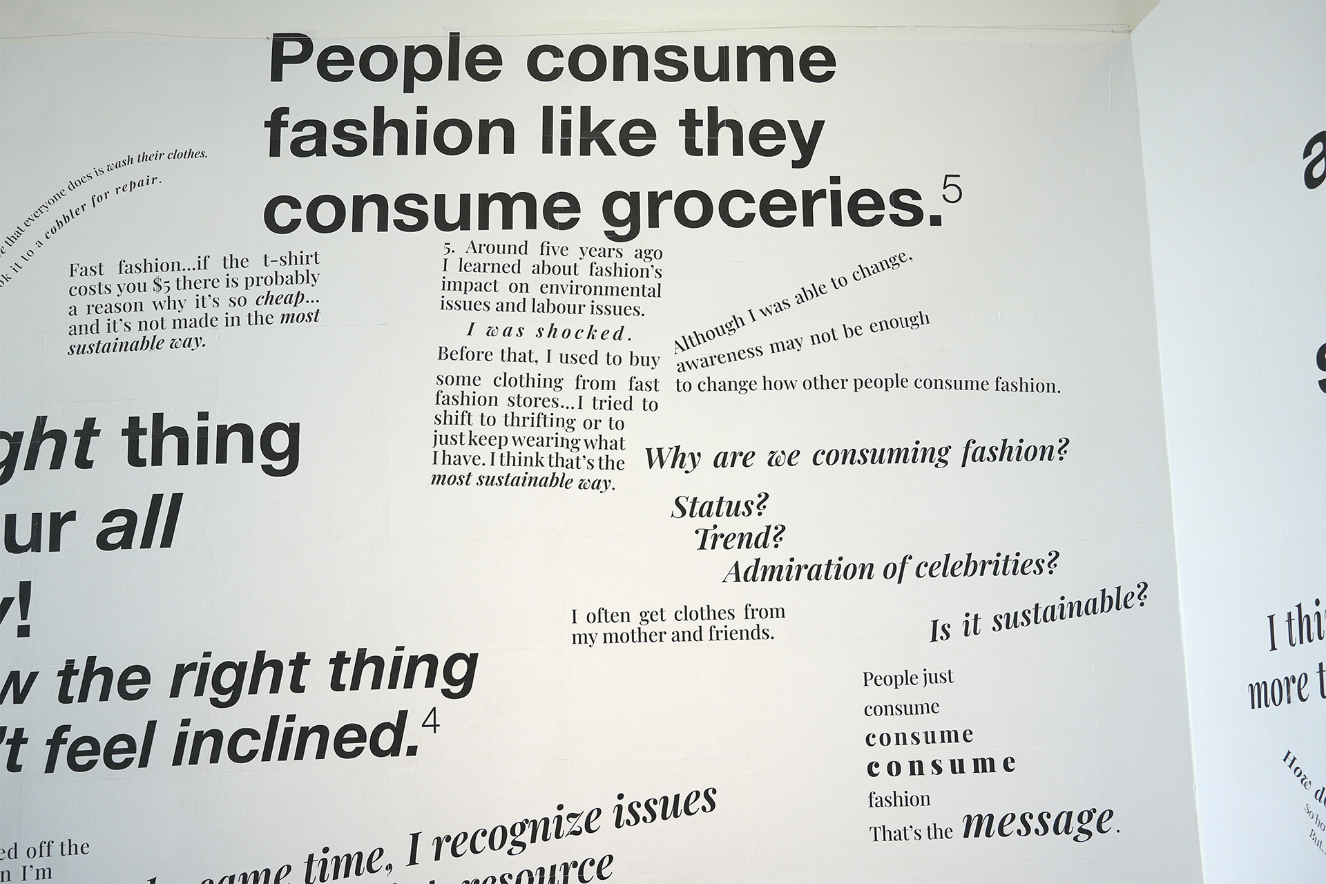
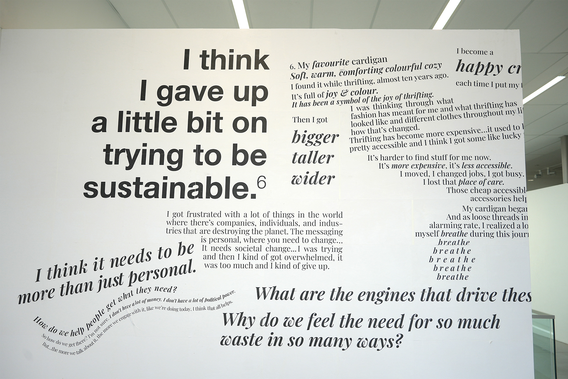
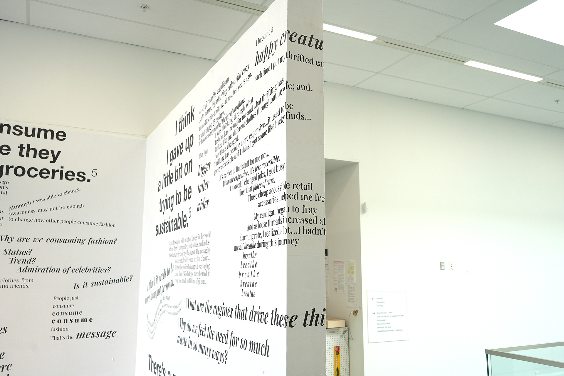
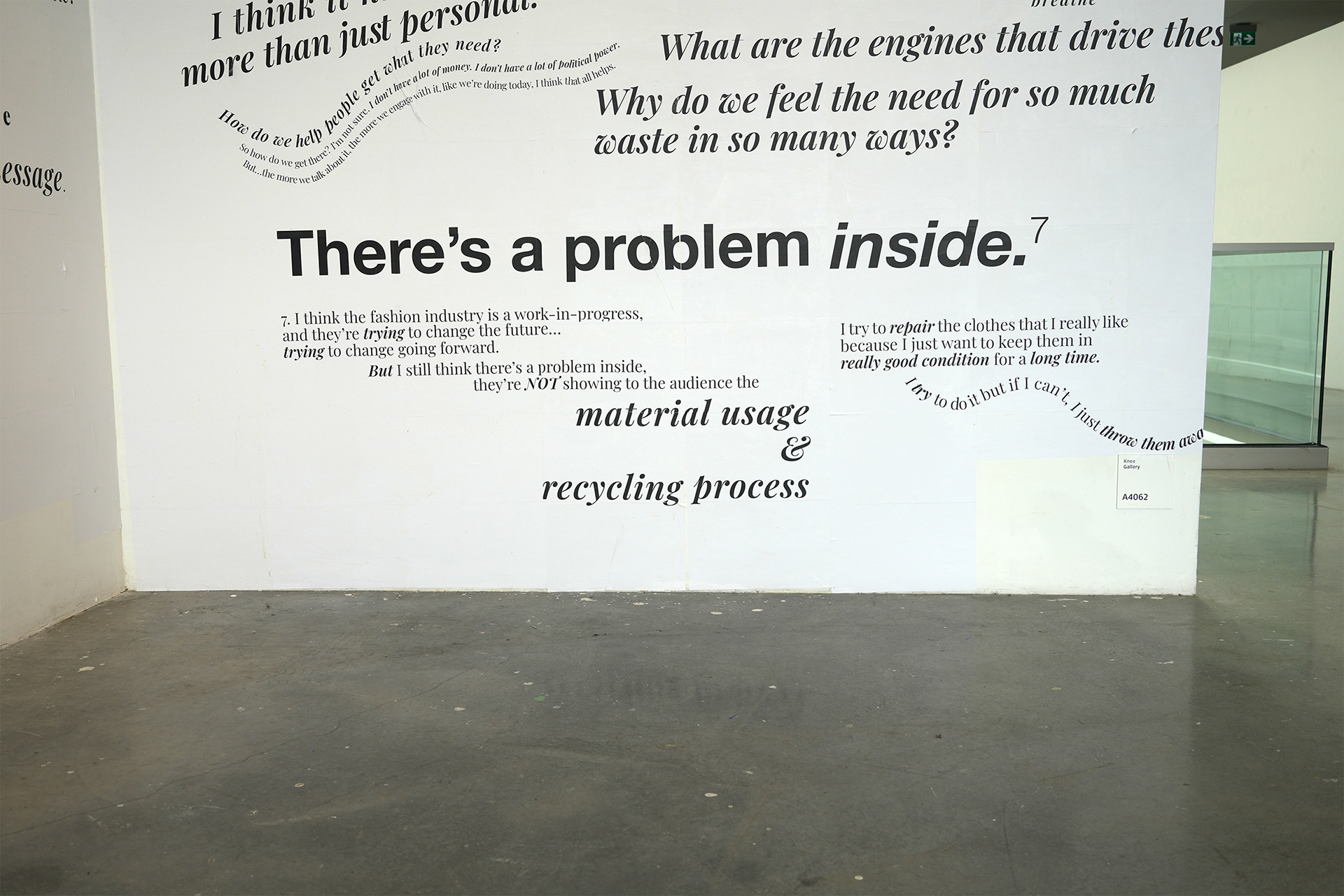
Based on qualitative summative content analysis of my zine-making workshops with seven student designers and visual artists, I use the finding of “footnotes on consuming between the blurry lines of fashion sustainability” as a creative direction to express their diverse lived experiences through my Footnotes* installation. Footnotes* is a text-based installation that is comprised of typography inkjet-printed on 384 sheets of 100% recycled paper that is wheat pasted and tiled onto a wall, measuring 10 x 40 feet. In this installation, I use a large-scale structure of footnotes to communicate the participant’s diverse experiences of successes and exceptions to engaging in sustainable fashion consumption which is at the centre of the timely contemporary conversation about how can we live without harming the planet.
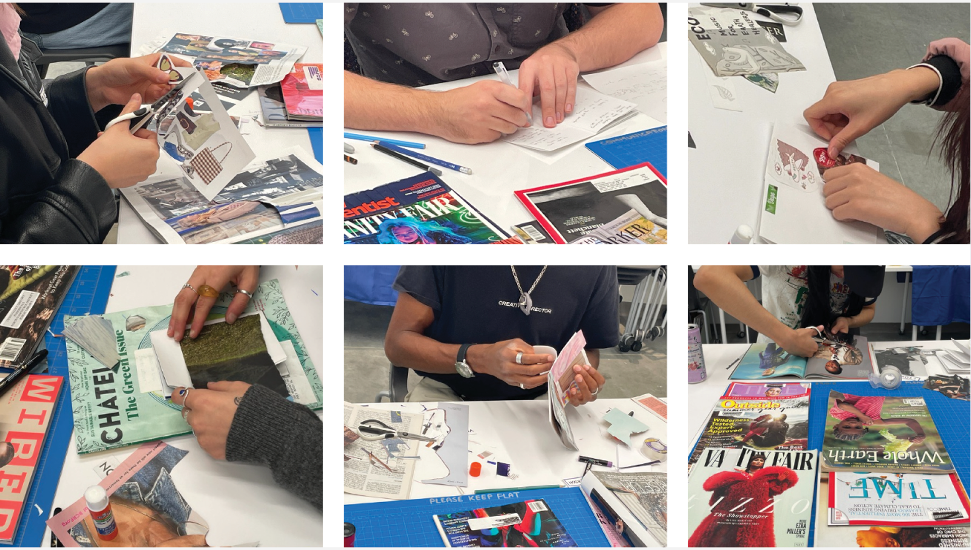
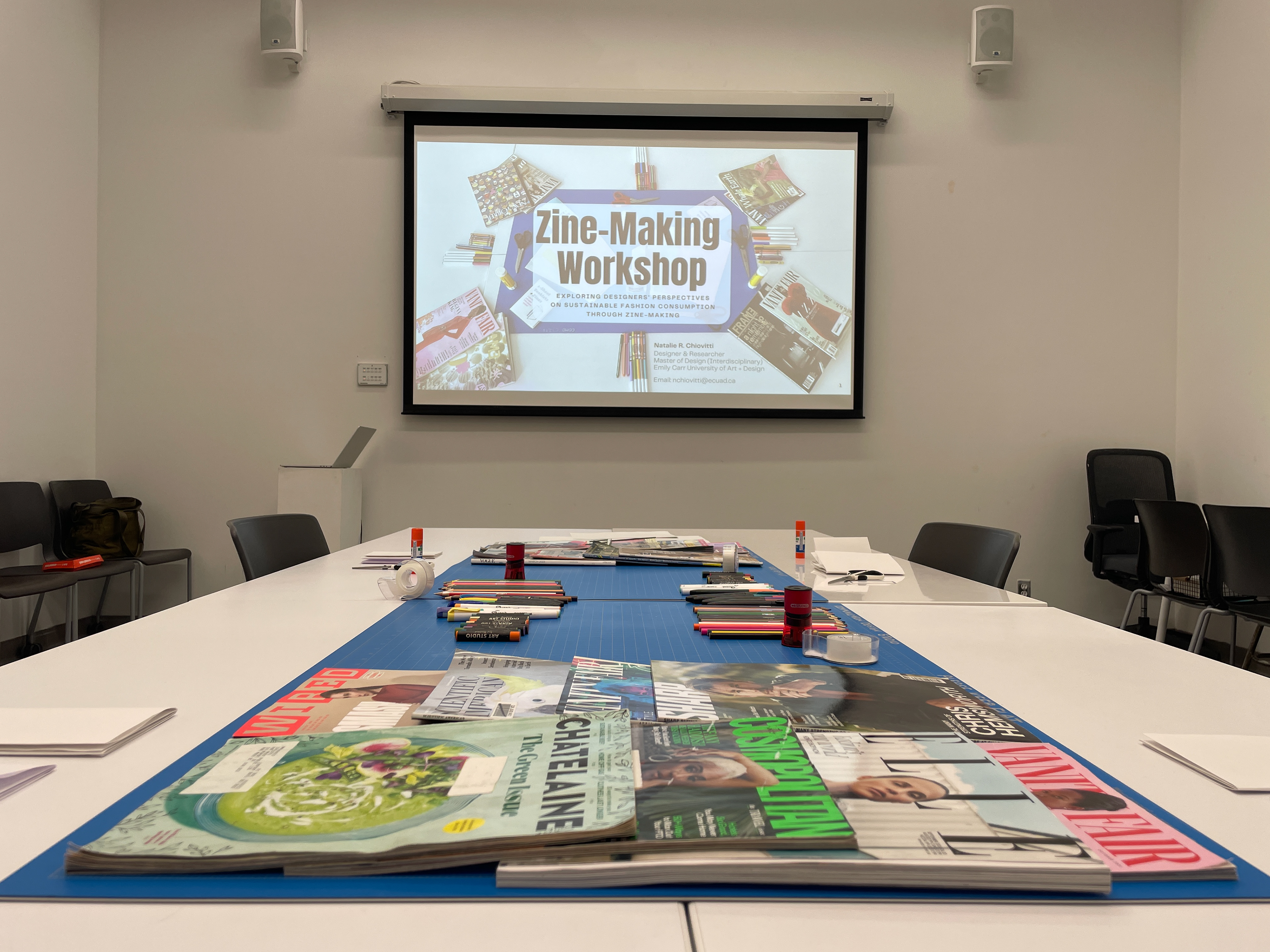

Overview of Zine-Making Workshops: In the zine-making workshops, seven student designers and visual artists made zines and engaged in a group discussion. Zine-making, as a design practice, provides ways for designers to access their perspectives on sustainable fashion consumption, maintenance, and messaging based on interpretations of their actions and interactions with others and themselves (their inner dialogue). Through zine-making workshops, I move away from the common definition of a consumer as a person or thing that uses, purchases, or eats. Instead, participants are viewed as social actors that construct their own meanings within a network of interactive relationships, social interactions with others and their interpretations, and hands-on practice by reflexively moving back-and-forth between individual making and community dialogue. Within the zine-making process, designers create their own and collective meanings of what climate-centric communication design is or could be. Recalling Troy R. Lovata’s notion of zines as a tool for connecting individuals to communities, the zines served as a visual medium for participants’ thoughts and feelings. In my zine-making workshops, some participants collaged with images and text from magazines, while other combined collaging with drawing or writing to remix and reframe commercial messaging and imagery to reflect their own perspectives in their zines about sustainable fashion consumption.
Development of "Footnotes" Creative Direction: Using qualitative summative content analysis, I identified one overarching theme; three categories, and 32 sub-categories each supported by direct quotations from the participants. The overarching theme across all participants is captured by the idea of "footnotes on consuming between the blurry lines of fashion sustainability" which describes how student designers’ balance their successes within sustainability along with the exceptions to engaging in sustainable fashion. Various perspectives across a spectrum emerged in maintaining and consuming fashion items as well as the messaging around fashion and climate crisis. Based on the content analysis, the idea of “footnotes” became my creative direction for the installation. Typically, a “footnote” is “a note of reference, explanation, or comment usually placed below the text on a printed page” when further information is needed. It is in this way that the idea of footnotes is well suited to conveying the pattern that I noticed during the data analysis in relation to how participants balance convenience and other factors that compete with their sustainable fashion practices in varying degrees.
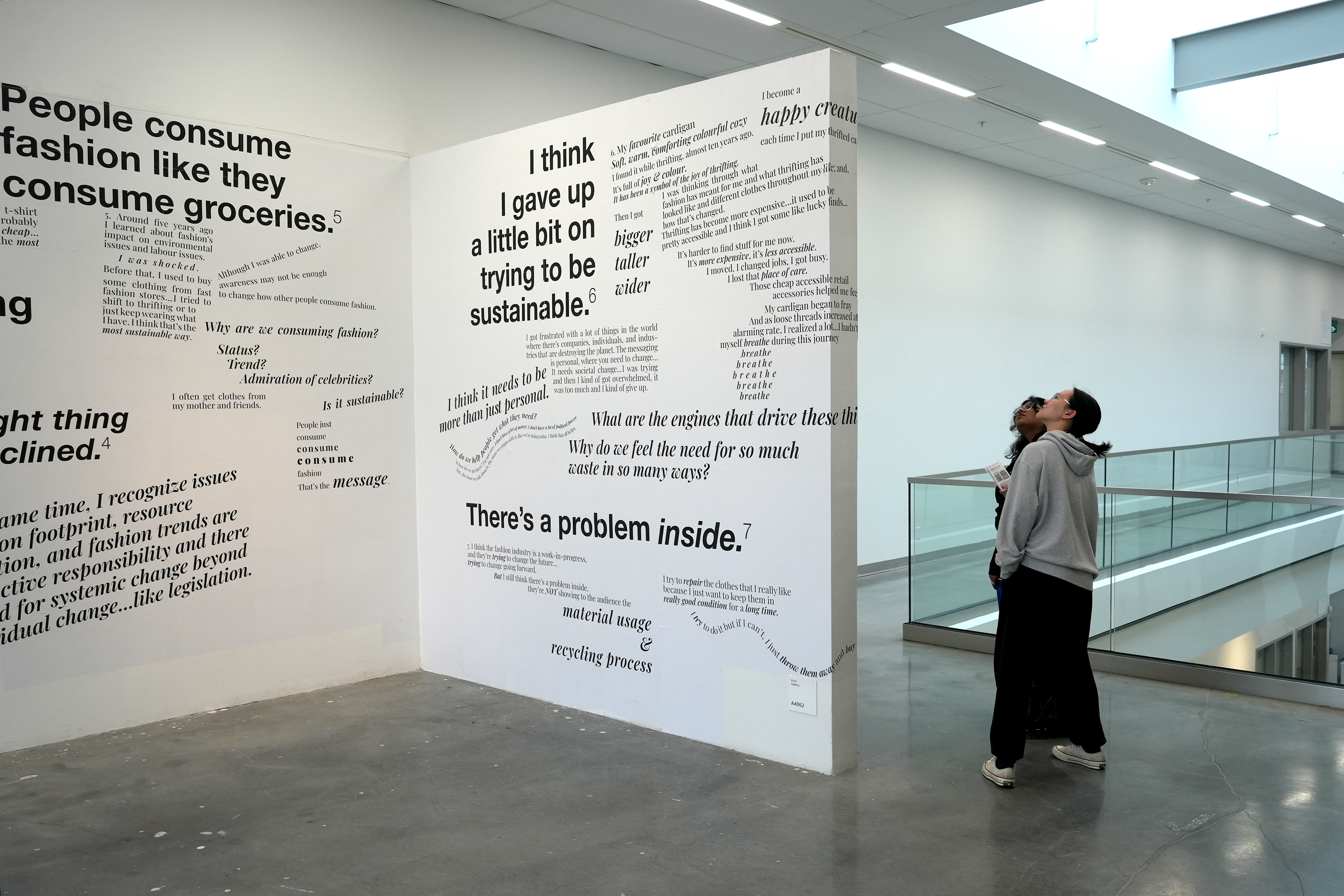
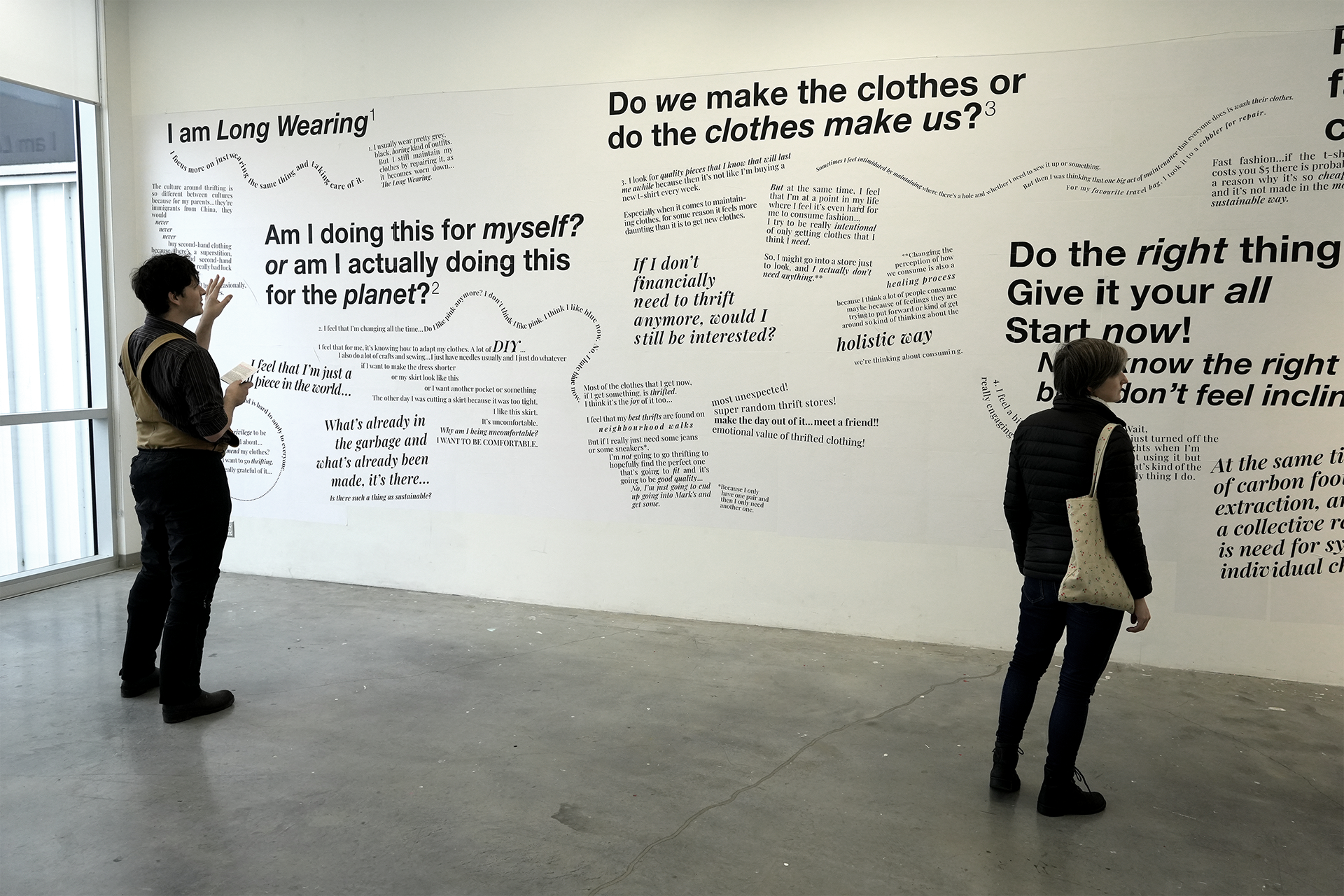
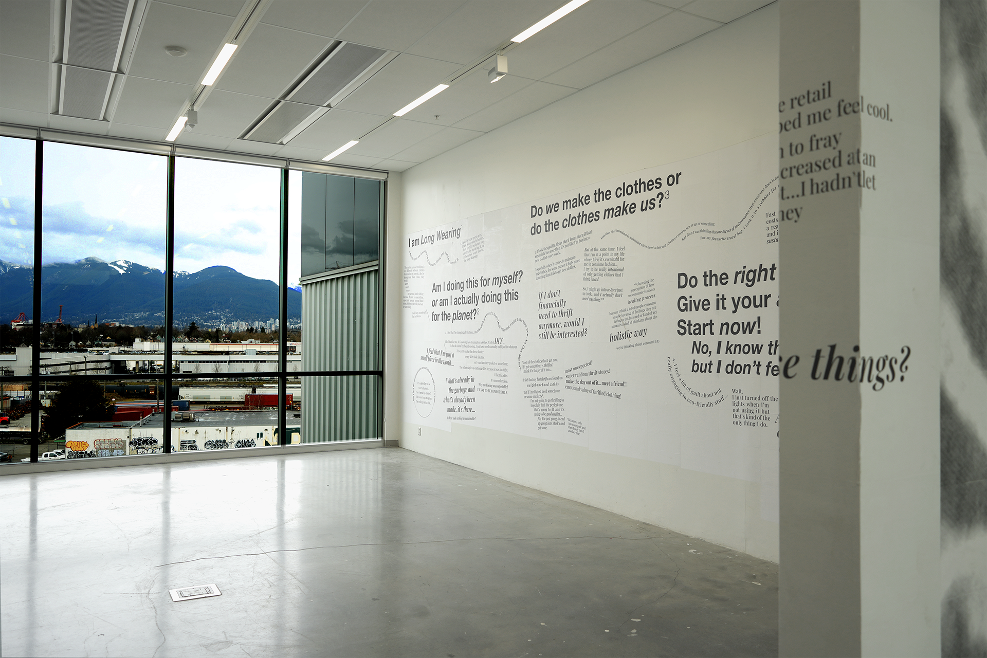
"Talking Wall" and Typography: An aim of the Footnotes* installation is to make sense of the dense information landscape, physical and digital, that surrounds us everyday through the language of communication design in a collective reading experience or a “talking wall” to reframe current design and messaging practices. The typography serves as a visual manifestation of the student designers’ language that expresses their tone, energy, and thought process during the zine-making workshops. Student designers’ perspectives are conveyed in a non-linear way through the use of typography that mimic the flow and rhythm of talking. The talking is displayed visually to bring to life student designer descriptions of the individual zines. For the taglines, I use Helvetica Neue typeface to create a clean modern look that is familiar to people through everyday media. For the footnotes, I use Playfair Display typeface to create a fashion industry aesthetic through a Didone style typography that is usually associated with Vogue fashion magazine. As with Roland Barthes (1977, 155-64), I view text as a network of information that is comprised of “references, echoes, and language” in which I deliberately use the navigational feature of taglines and footnotes found in publications and advertising. Each tagline is a direct quotation from the participants that captures the essence of their experience and is further described through its corresponding footnote. The structure of a footnote provides an entrance and exit from the one-way stream of discourse in the taglines such as “Am I doing this for myself, or am I actually doing it for the planet?” Aligned with Donald Schön (1983, p. 130), I strove to communicate multiple perspectives by bringing forward nuances through “...artistry [that] is evident in [my] selective management of large amounts of information [using the structure of taglines and footnotes]...to hold several ways of looking at things without disrupting the flow of inquiry.”
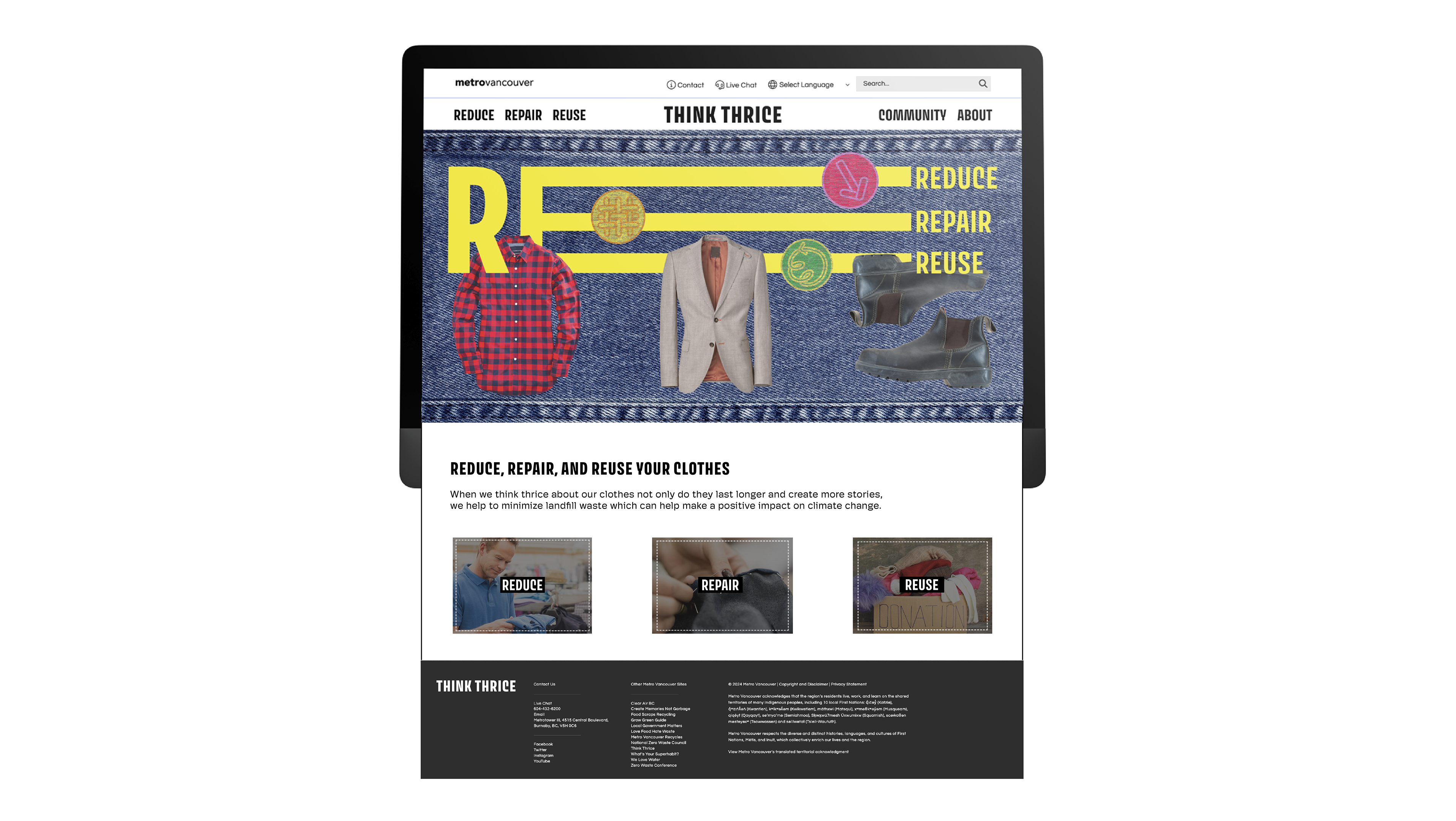
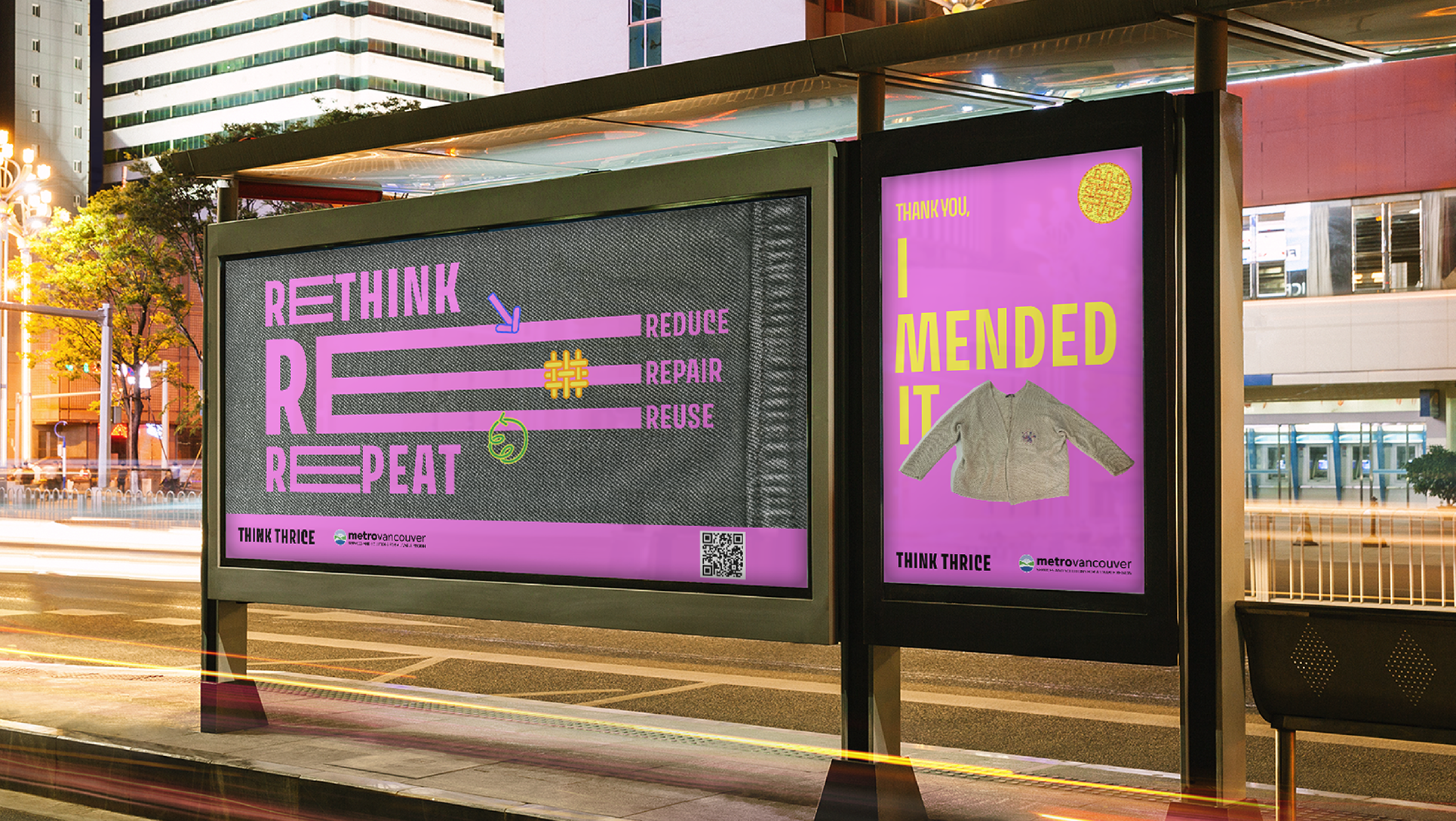
"Footnotes" Creative Direction: Although a footnote is usually considered as extra and not part of the main conversation, in my research, the idea of a “footnote” is repurposed to be part of the main conversation. My creative direction of “footnotes” is a way to modify, refine, and repurpose practices within current systems to allow a plurality or spectrum of viewpoints as part of the main messaging. This is consistent with Matthew Wizinsky’s (2022, p. 246) view that “direct engagement with designing or redesigning…is an ‘experience’ to be designed by the…designer”. In the process of this designing and redesigning, the main finding and creative direction of “footnotes” creates a space for reframing broad messaging from systems by honouring diverse lived experiences of student designers and visual artists through their direct quotations communicated typographically as seven taglines and corresponding footnotes (see Table 1). In this way, the creative direction of “footnotes” is proposed as a tactic to help navigate and raise awareness around sustainable fashion consumption within the strategies of overarching systems, such as the United Nations Sustainable Development Goals, CNCA, and Metro Vancouver’s Repair Re-wear campaign (previously known as Think Thrice). This is in line with Michel de Certeau’s (1984, p. 35-38) concept of “tactics” and “strategies”, in which people are viewed as actively repurposing daily life through their everyday practices (tactic) within the constraints of overarching current systems (strategy). Alternating between consumption choices: repair, reuse, repurpose by self or others, and systemic change beyond individual change are some take-aways within the three categories of consumption, maintenance, and messaging around sustainable fashion for climate-centric communication designers, and led to the overarching creative direction of “footnotes” (see Table 1).

Table 1. Takeaways for climate-centric communication designers based on taglines and footnotes within the three categories of consumption, maintenance, and messaging in sustainable fashion


Abbreviated Bibliography and Notes
Baneet Braich, “Textile Waste is a Growing Problem — And Canada Still Isn’t Doing Enough to Solve it, Experts Say,” CBC News, February 28, 2022.
Bruno Latour, Reassembling the Social: An Introduction to Actor-Network-Theory, (New York: Oxford University Press, 2005).
Christopher Frayling, “Research in art and design,” Royal College of Art Research Papers series 1, no. 1 (1993): 1-5.
Donald A. Schön, The Reflective Practitioner: How Professionals Think in Action (New York: Basic Books, 1983), 130.
Dr. Maite García Sanchis (Adjunct Professor, Politecnico di Milano) described the Footnotes* installation as a “talking wall” while visiting ECU on February 21, 2025.
“Footnote,” Merriam Webster Dictionary, n.d.
Herbert Blumer, “The Methodological Position of Symbolic Interactionism,” in Symbolic interactionism: Perspective and Method (California: University of California Press, 1969).
John Dewey, Experience and Nature (Chicago: Dover Publications, 1925).
Julia B. Corbett, “Individuals as Social Actors, Not Consumers,” in Communicating the Climate Crisis: New Directions for Facing What Lies Ahead, ed. C. Vail Fletcher (Lanham: Lexington Books, 2021), 56.
Kate Fletcher and Mathilda Tham, Earth Logic Fashion Action Research Plan (London: The J J Charitable Trust, 2019).
Matthew Wizinsky, “Design After Capitalism, in Practice,” in Design After Capitalism: Transforming Design Today for an Equitable Tomorrow (Cambridge: MIT Press, 2022), 246.
Michel de Certeau, The Practice of Everyday Life, translated by Steven Rendall (Los Angeles: University of California Press, 1984), 35-38. Note: de Certeau’s strategies are used by pre-existing systems to manage and organize space, while tactics are the ways individuals navigate and repurpose that space to reframe the strategies.
Roland Barthes, “From Work to Text,” in Image/Music/Text (New York: Hill and Wang, 1977), 155-64.
Teal Triggs, Fanzines: The DIY Revolution (San Francisco: Chronicle Books, 2010), 7.
Troy R. Lovata, “Zines: Individual to Community,” in Handbook of the Arts in Qualitative Research: Perspective, Methodologies, Examples, and Issues, ed. J. Gary Knowles and Ardra L. Cole (Toronto: Sage Publications, 2008), 323, 329-331.
United Nations, “Target 12.8 of Goal 12 Sustainable Consumption and Production Patterns,” last modified July 10, 2023.
Zoë Sadokierski, “Developing Critical Documentation Practices for Design Researchers,” Design Studies 69, no. 1 (2020): 1-33.