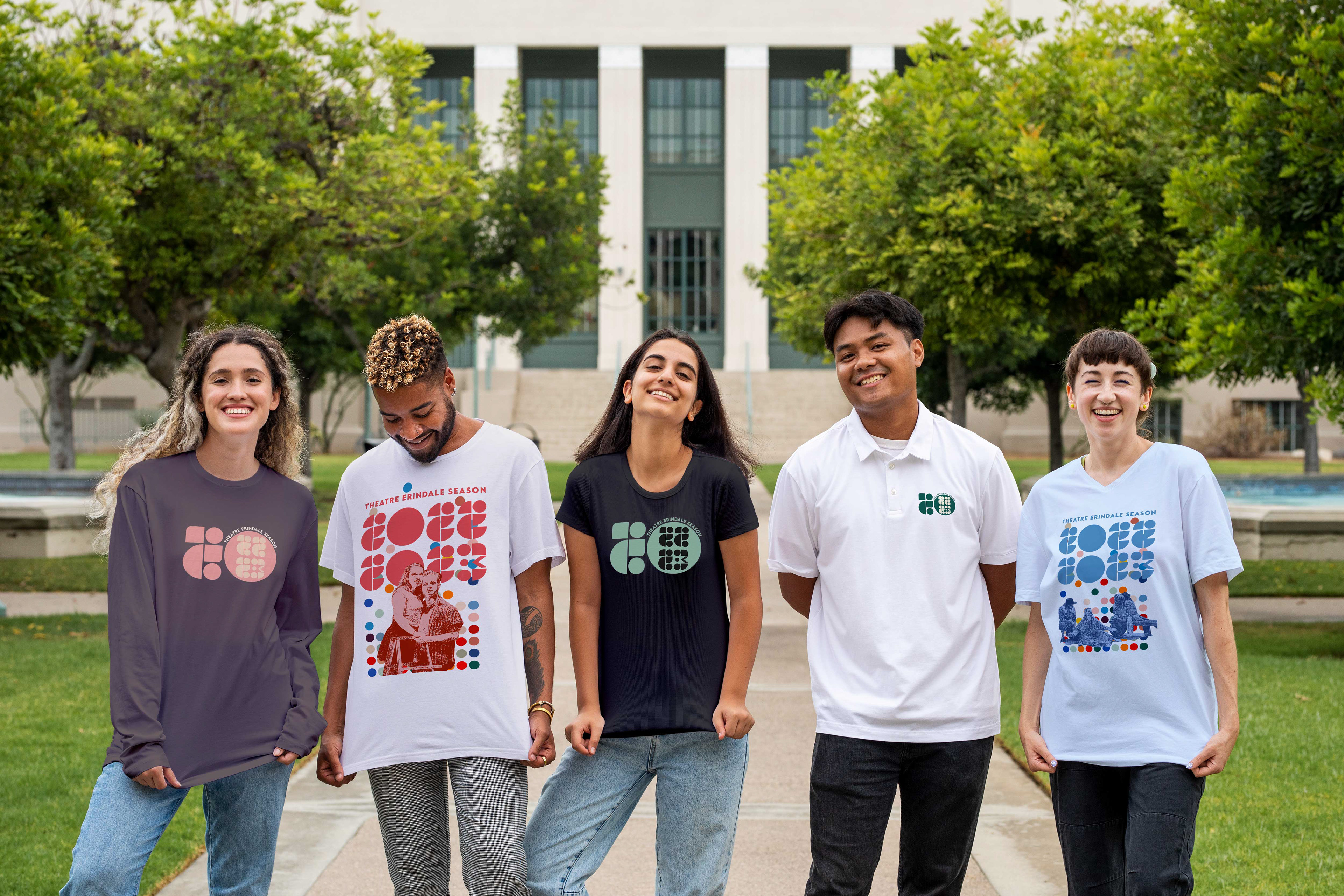
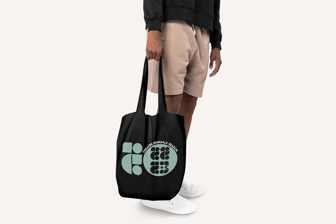
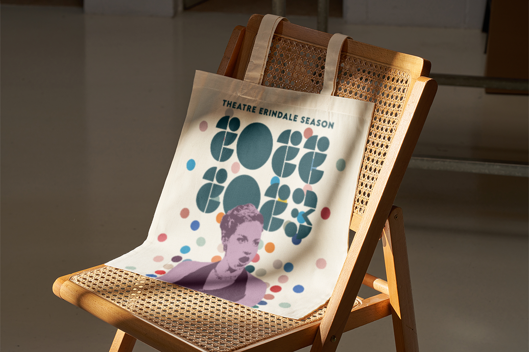
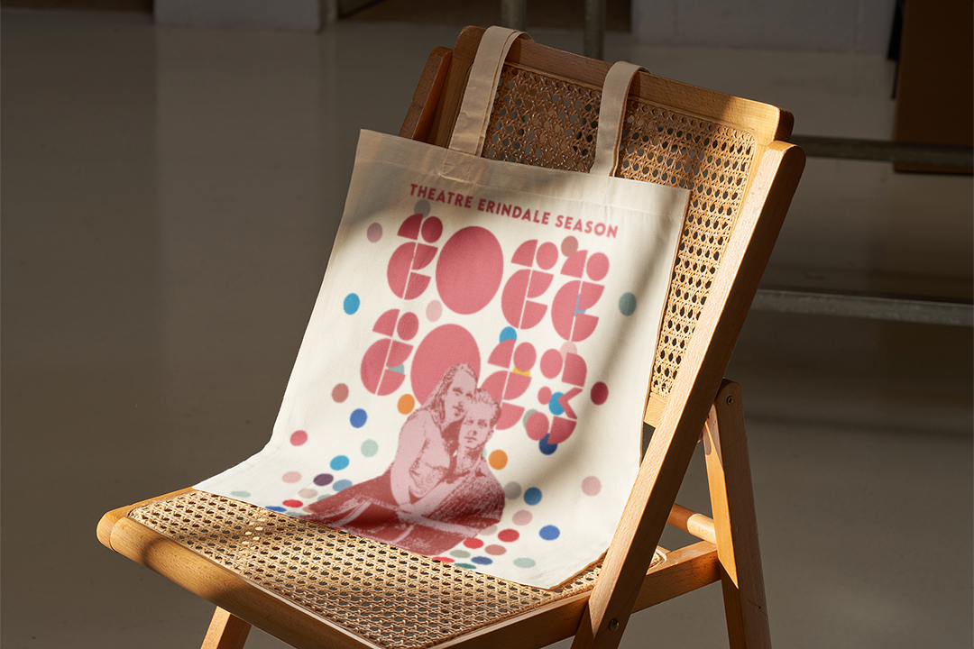
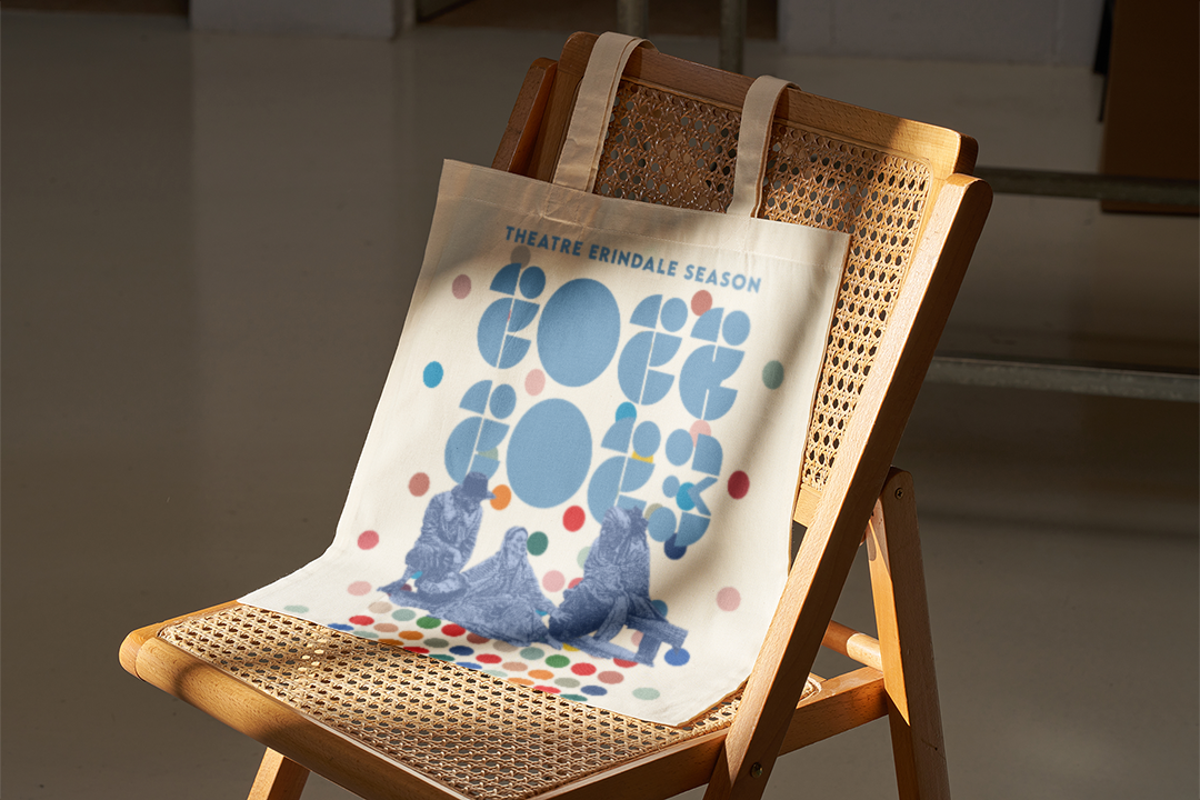
Theatre Erindale 22/23 Season
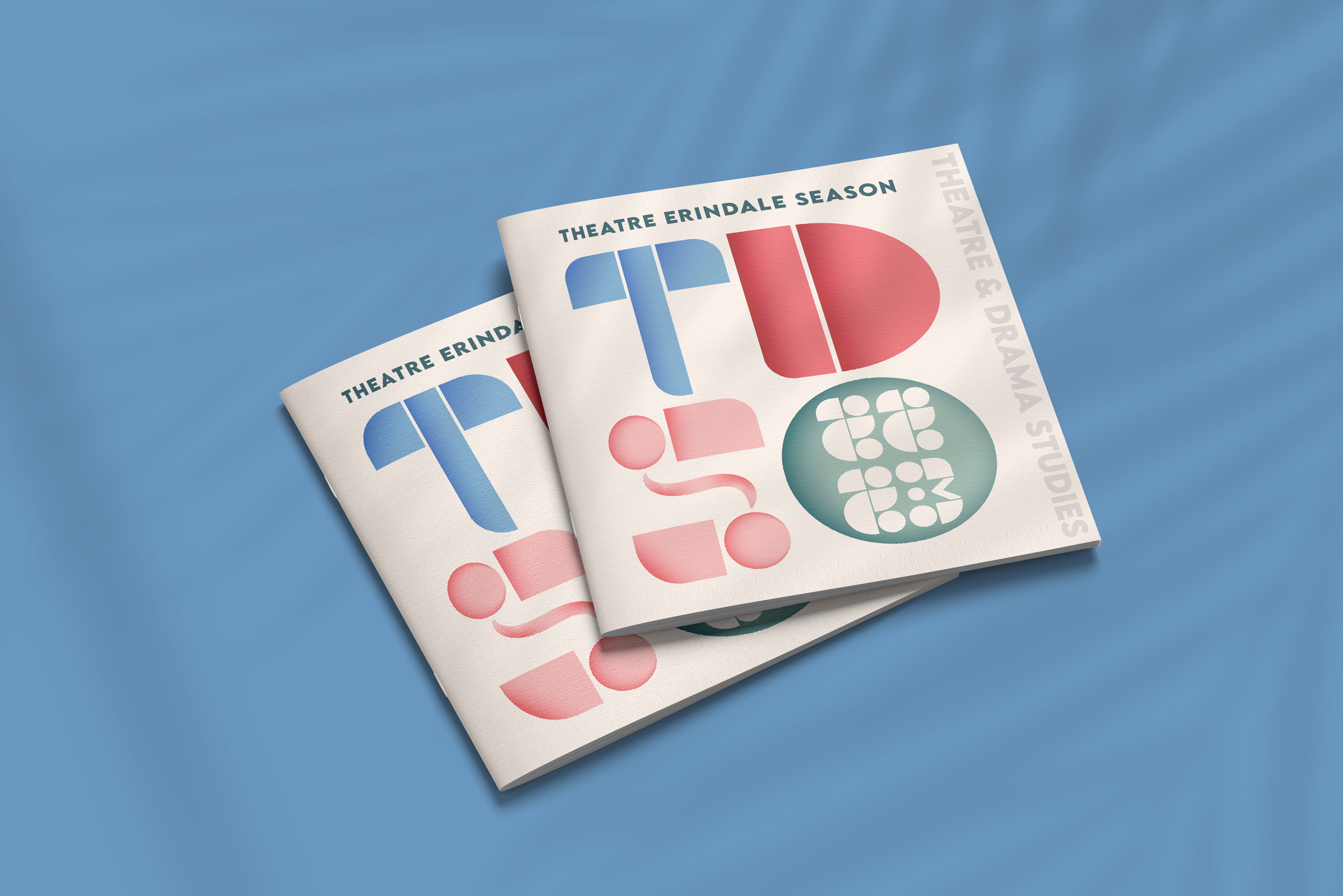
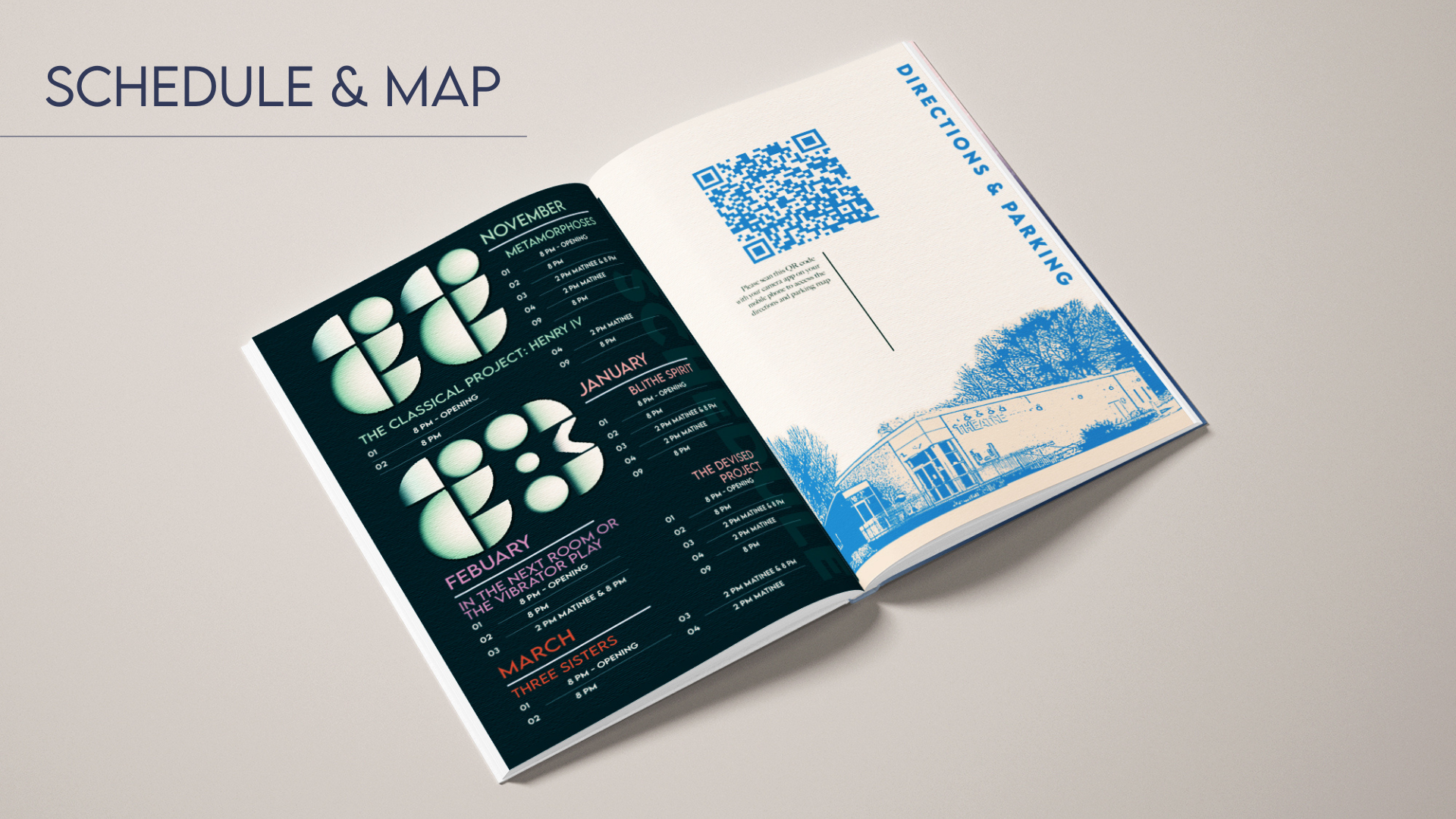
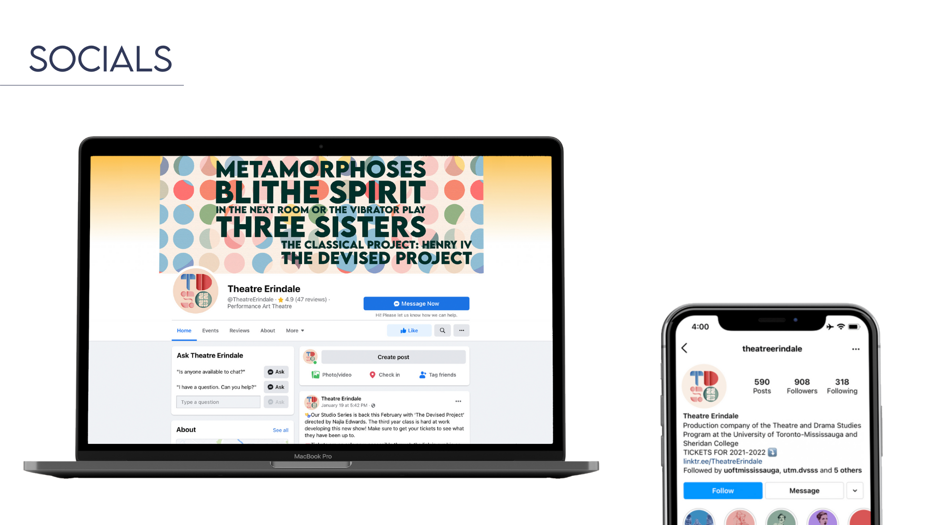
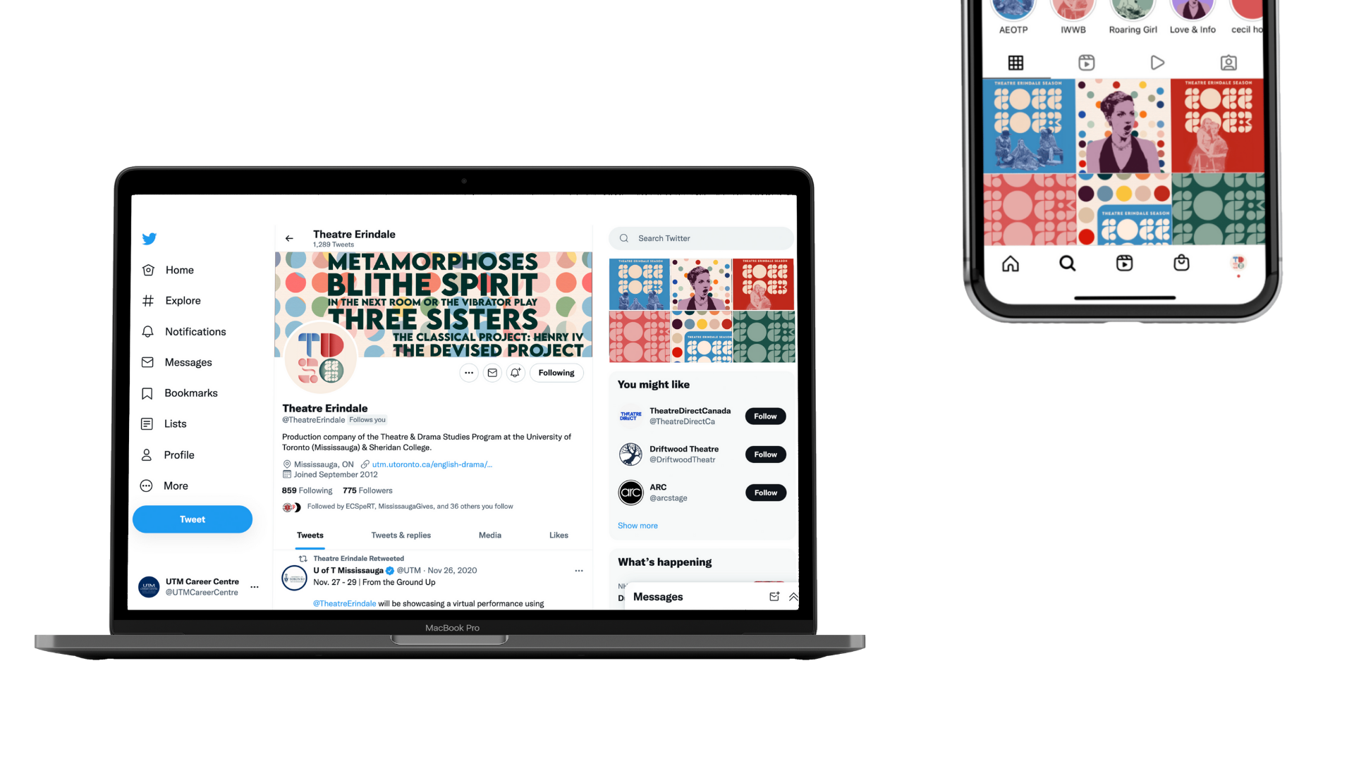
Deliverables: Brand Identity–Logo, custom number design ‘Geo Theatre’, theatre programme, print advertisements, social media, and merch design
Tools: Adobe Illustrator, Photoshop, InDesign & photo archive from Theatre Erindale
Project Type: Client-based independent project
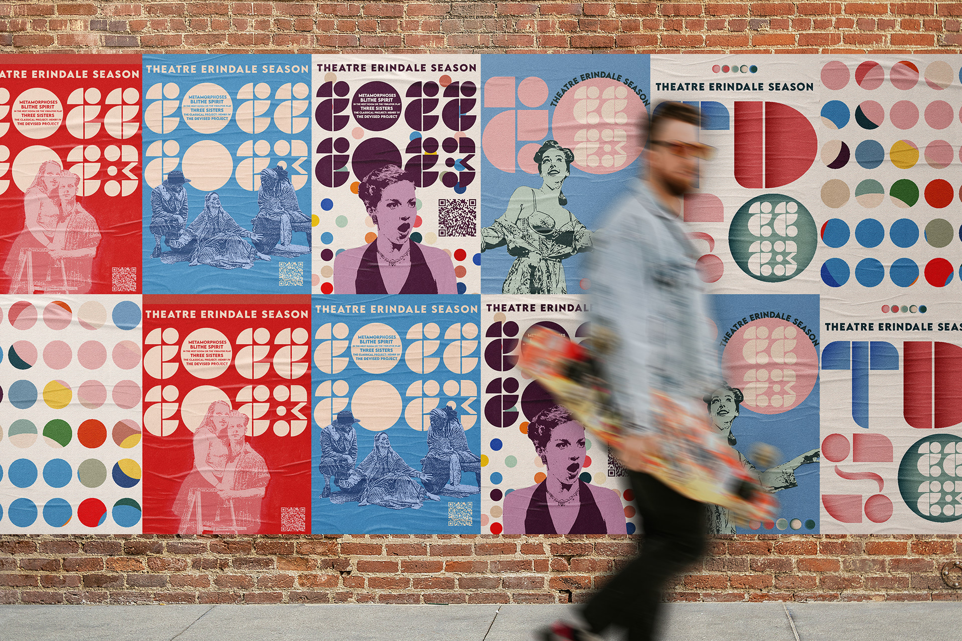
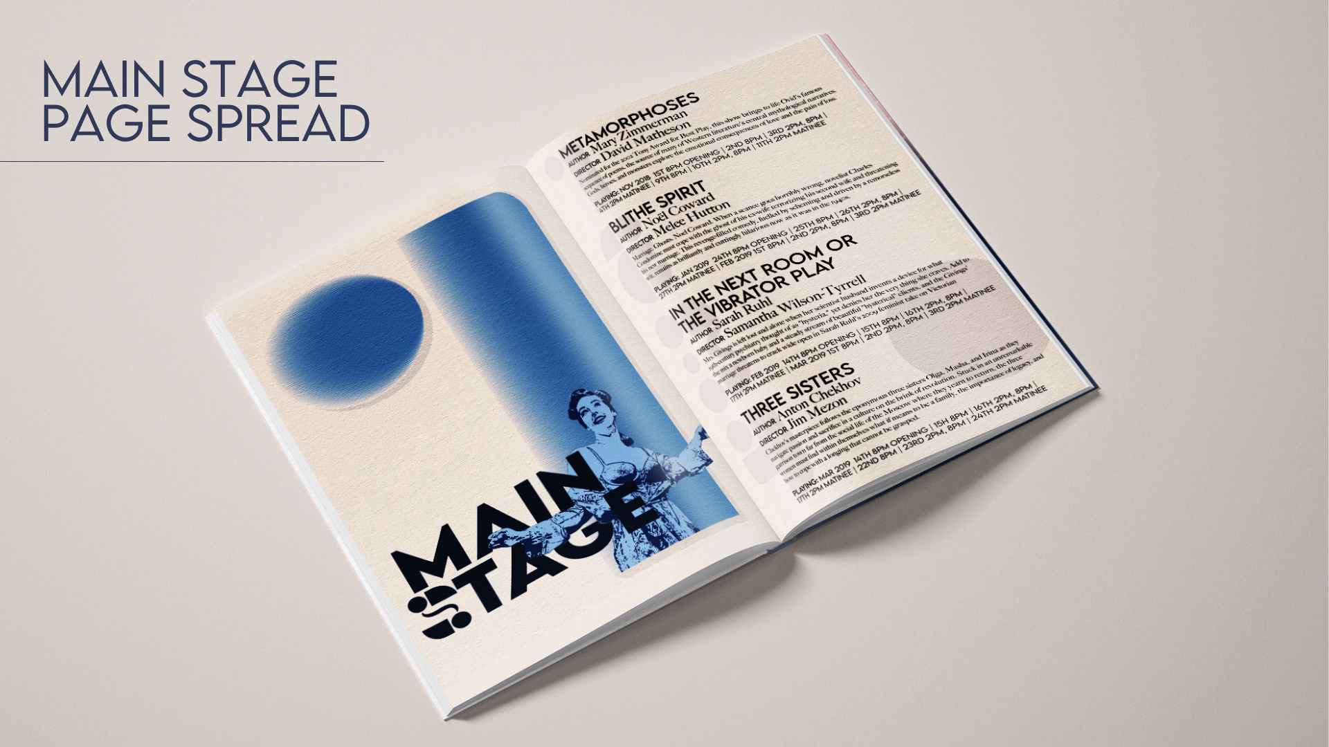
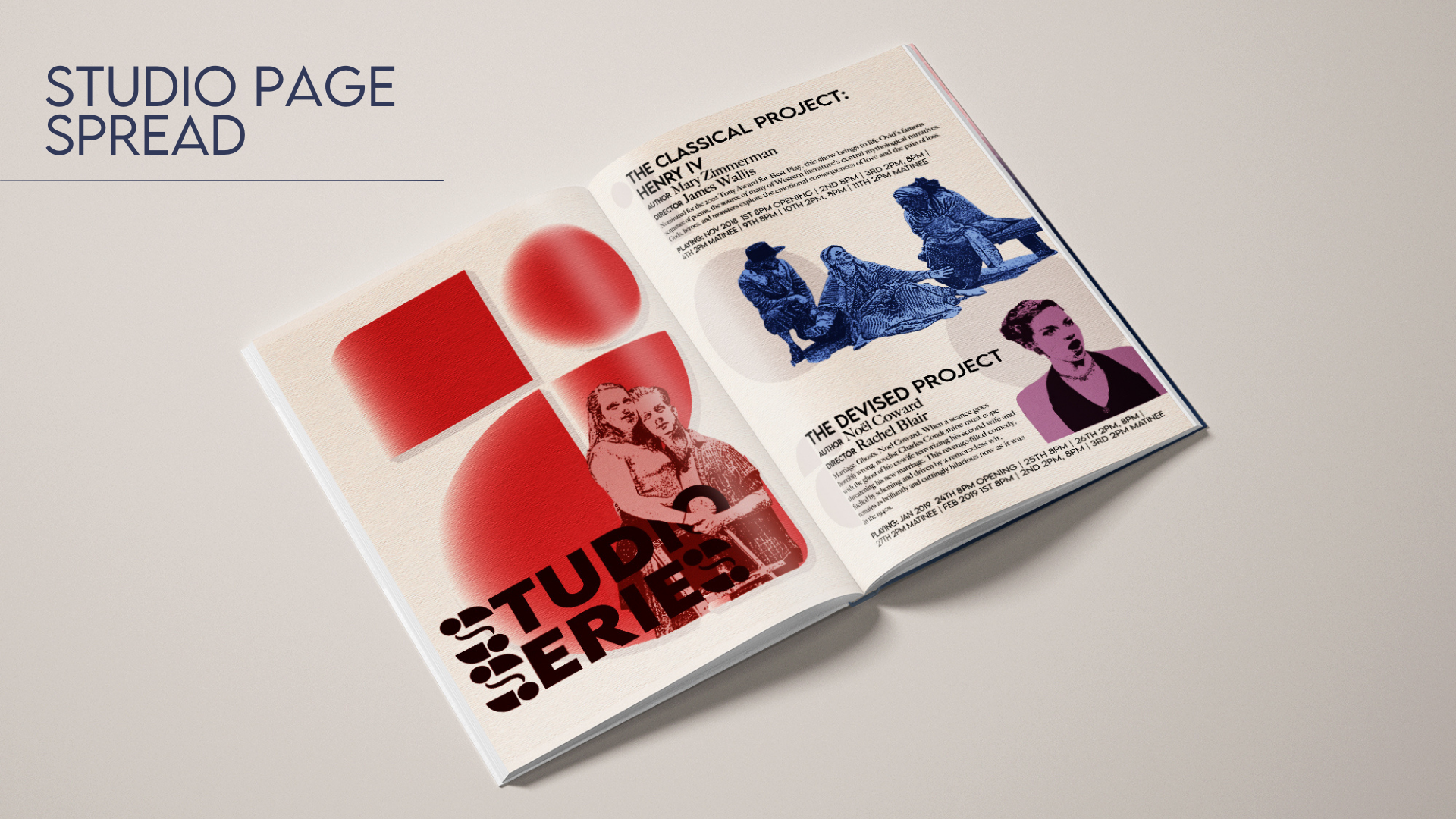
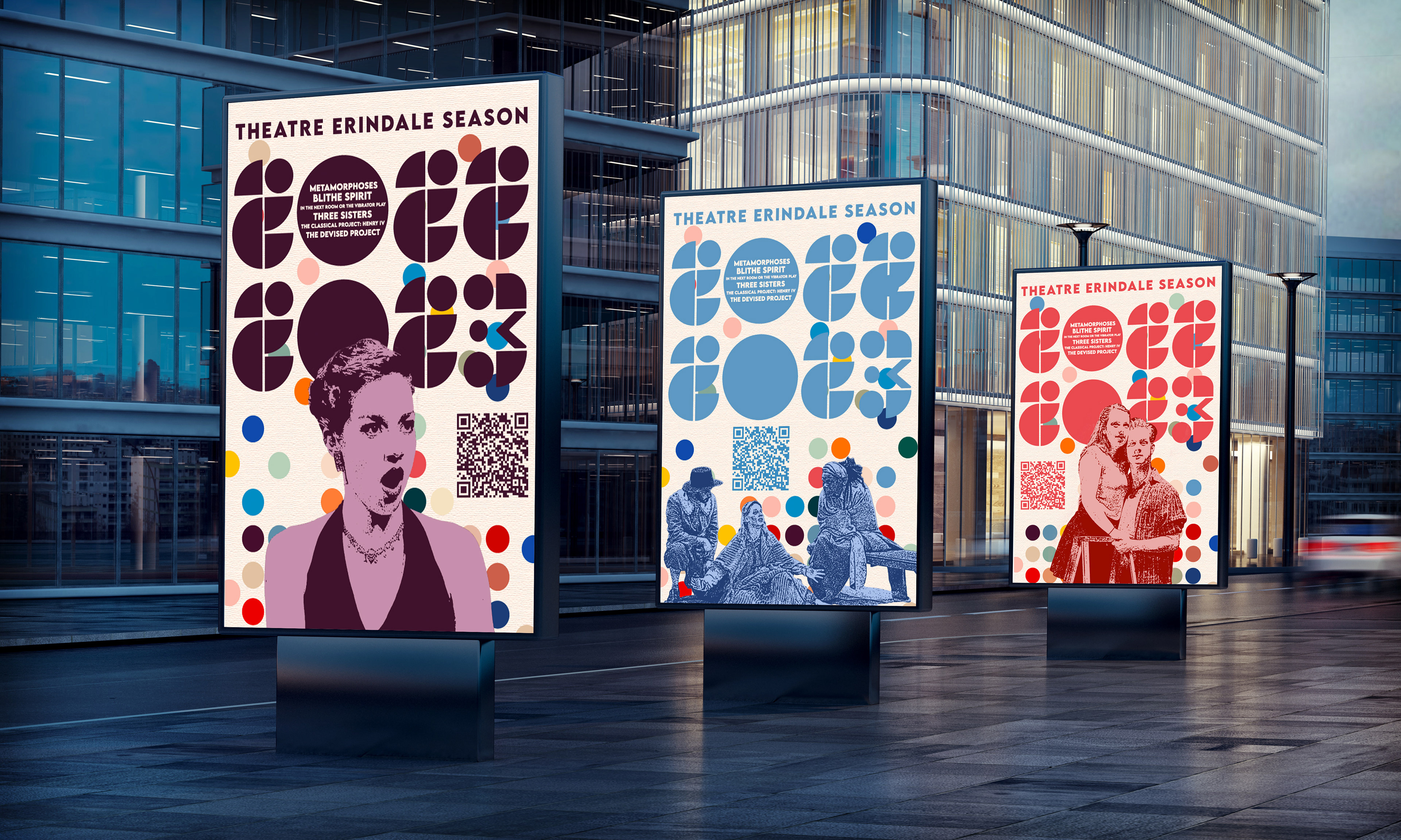
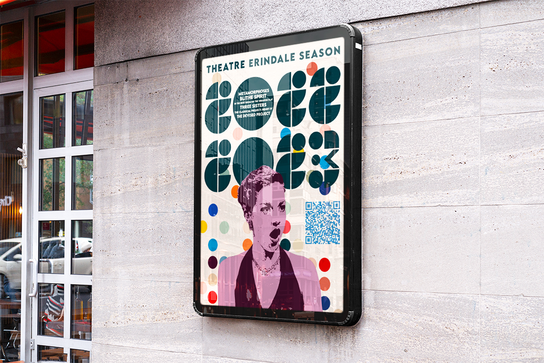
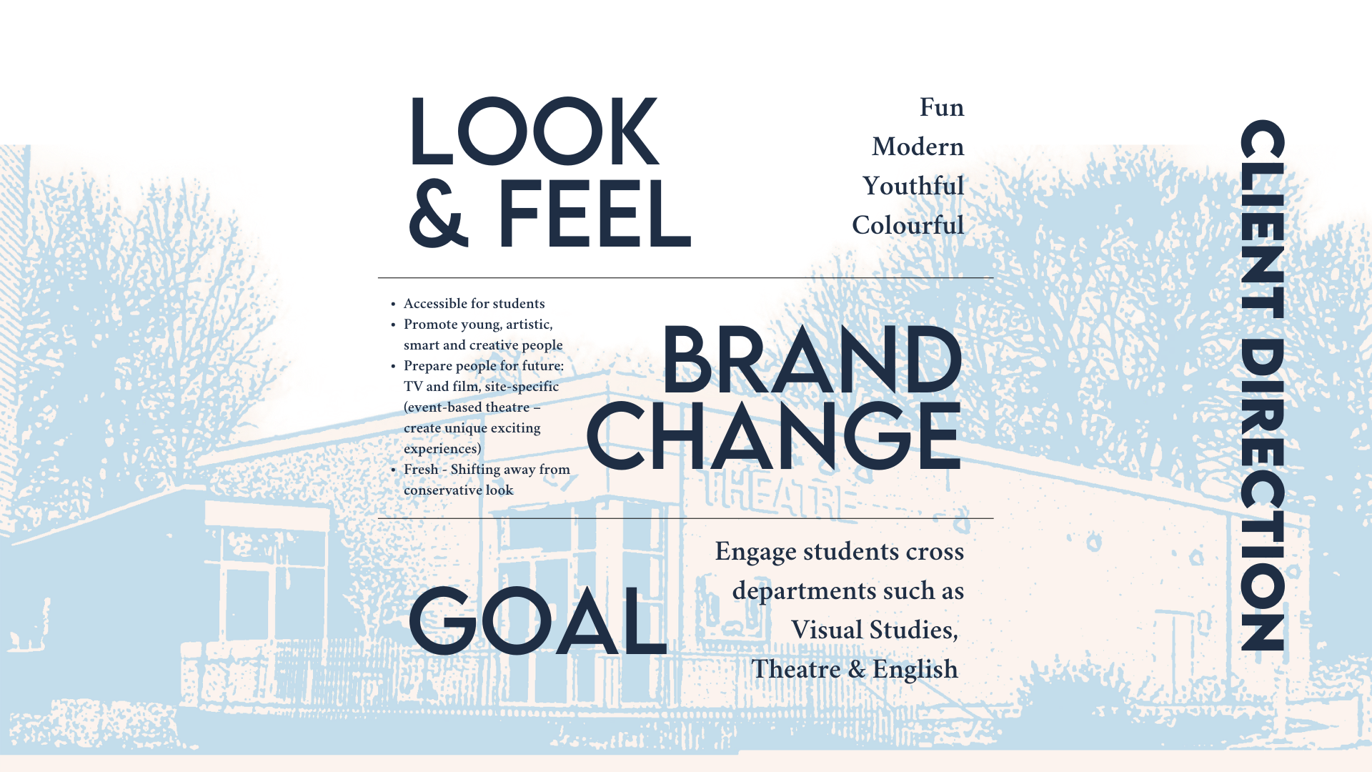
Theatre Erindale (est. 1991) is the production company of the Theatre and Drama Studies program at the University of Toronto Mississauga that presents plays from the classical works of Shakespeare to plays written by theatre students. The budding excitement of plays comprised of emerging actors, directors, and writers is known for welcoming undergraduate students across disciplines and theatre enthusiasts to be immersed in the stories from the moment the curtain opens. The Theatre Erindale group requested a change to the brand’s look and feel to one that embraces a sense of playfulness, timeless youthfulness, and a vintage theatre aesthetic with a modern touch. Reviewing Theatre Erindale’s photograph archive of past performances inspired me to edit the photos into stamp-like illustrations of student actors set in a vibrant colour palette. Further, to visually communicate a sense of playfulness and energy, I designed custom geometric numbers called Geo Theatre and a logo inspired by the lively and confident movements and interactions of the actors on stage that were in the photograph archive.
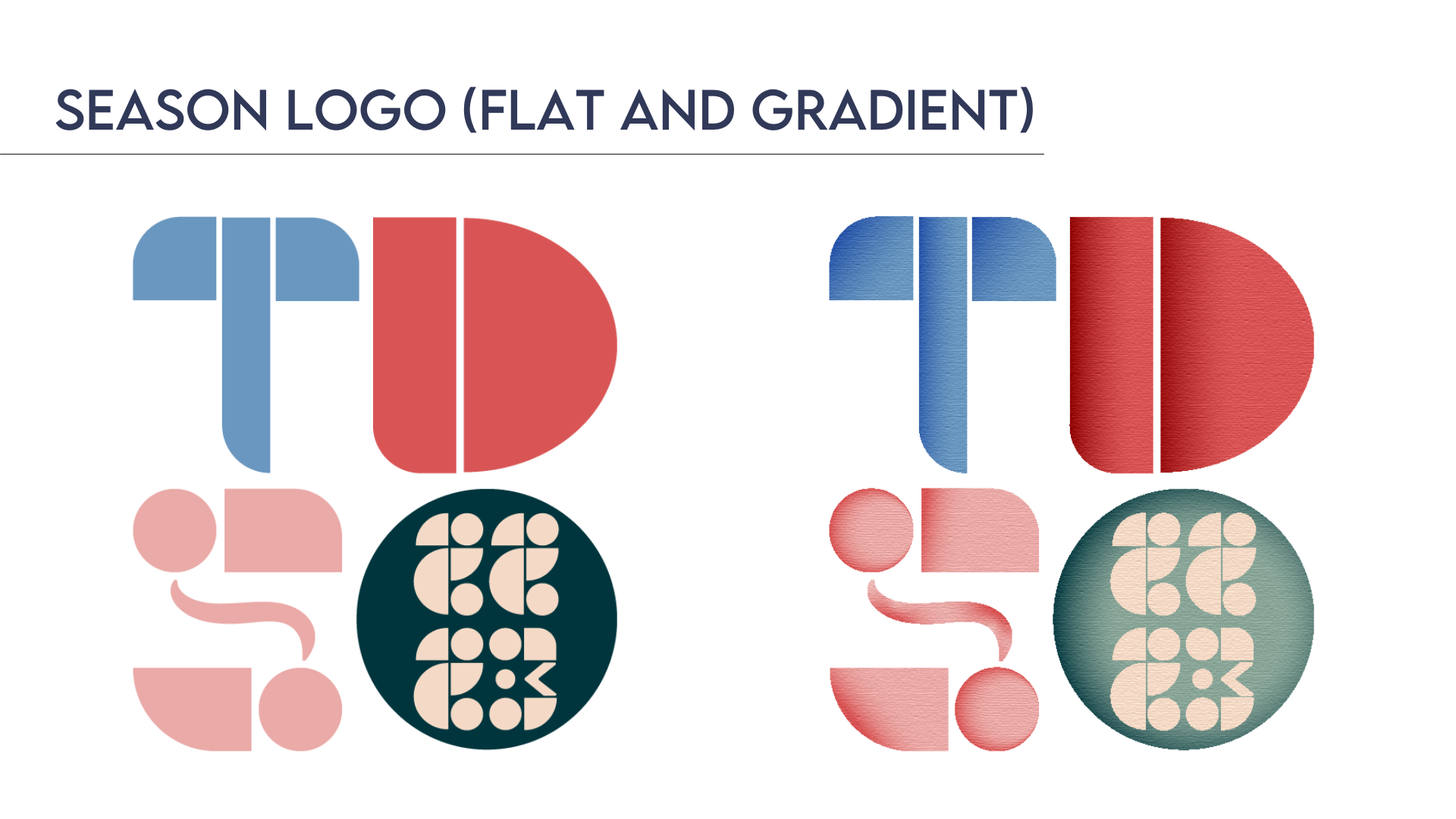
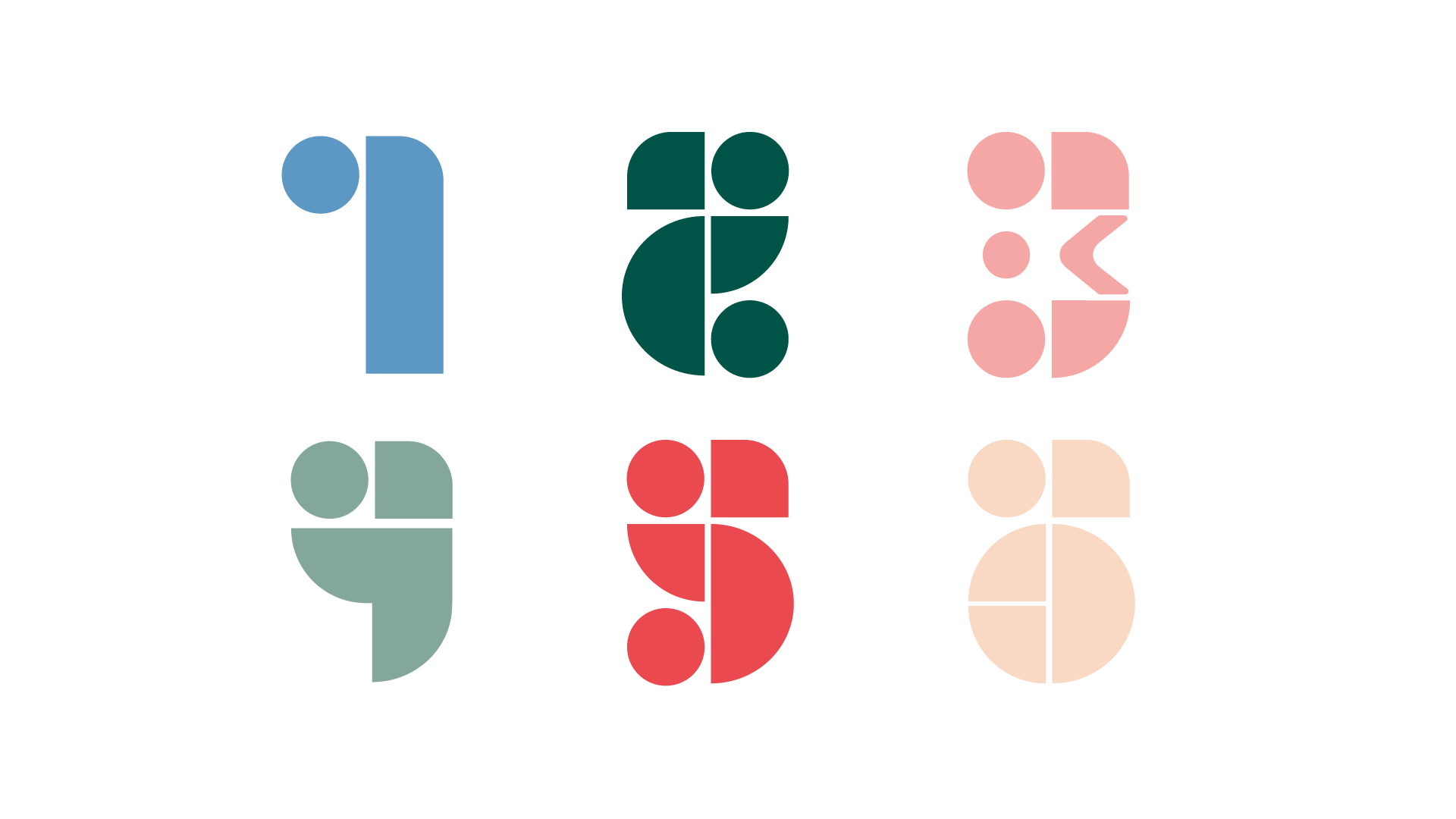
Geo Theatre custom numbers