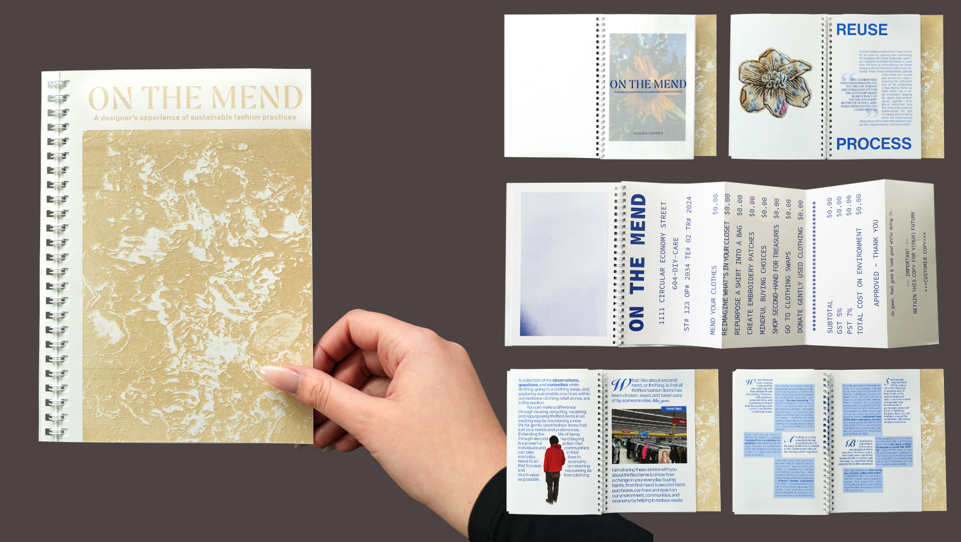
The Alcuin Society Awards
Deliverable: Awards Catalogue
Role: Catalogue Designer
Project Type: Independent and collaborative team including:
• Two project managers (Vancouver and Toronto)
• Three editors (English and French)
• Design consultant
• Copywriter
• Two photographers
• Printer (Bond Reproductions Inc.)
Client: The Alcuin Society
Specifications: 7.5 × 11 in., 120 pages; perfect bind; edition of 400; Digital printing on FSC certified supreme silk text and silk cover
Tools: Adobe InDesign and Photoshop, Bond Reproductions Inc.
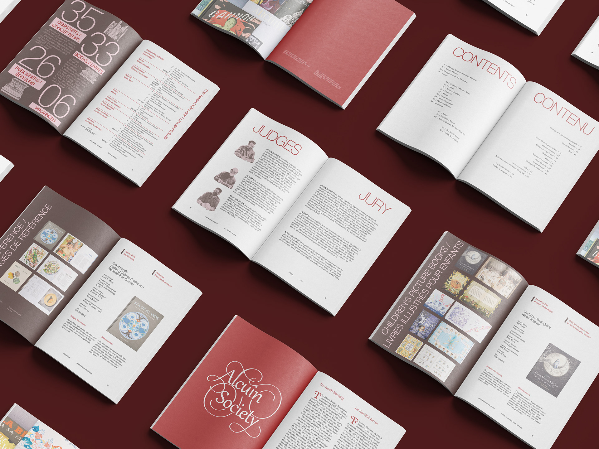
2025 Catalogue
Published August 2026
The Alcuin Society promotes the appreciation of the physical book and elements that bring forth the author’s thoughts and simultaneously enhances the reader’s experience. As the longest-running national competition since 1981, The Alcuin Society Awards for Excellence in Book Design in Canada, recognizes and celebrates Canadian book design. The Alcuin Society is named after the Alcuin of York (c. 735–804 AD) for his substantial library of books and his influence on the development of legible script of its day.
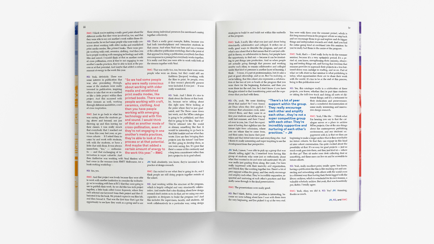
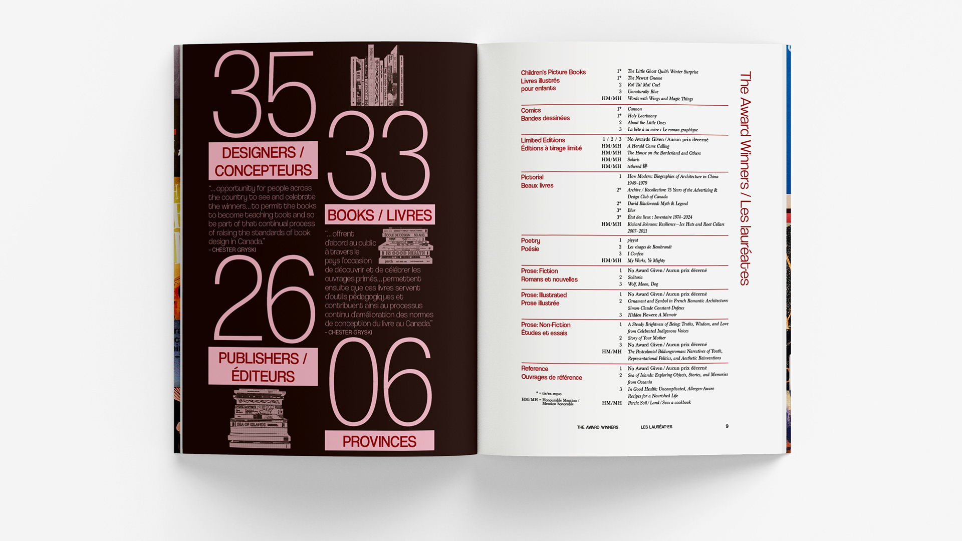
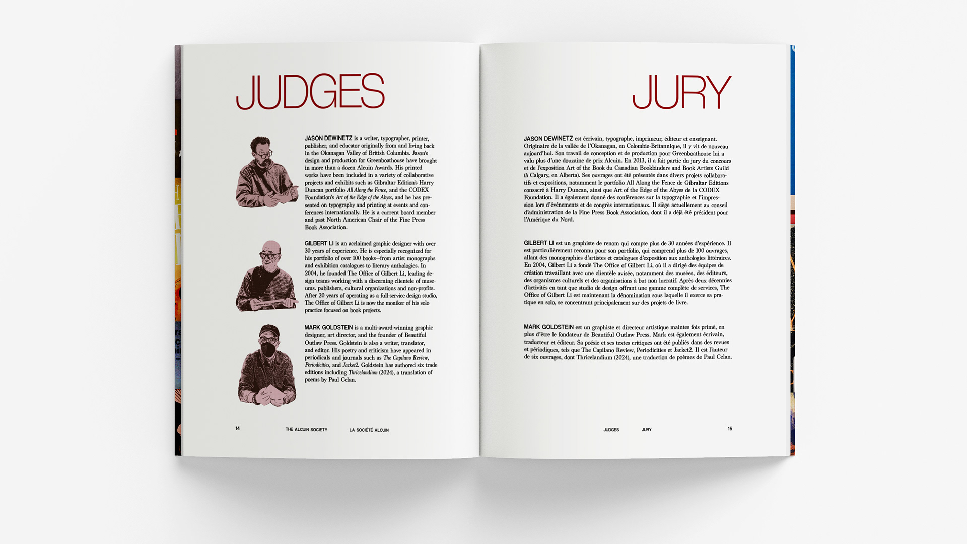
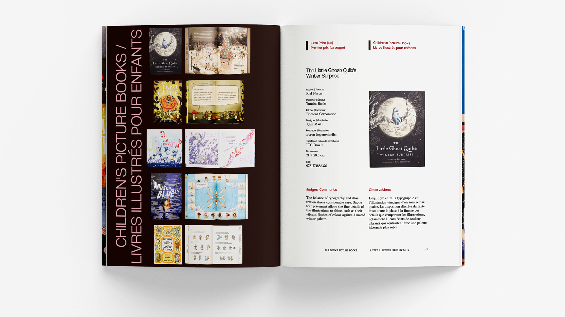
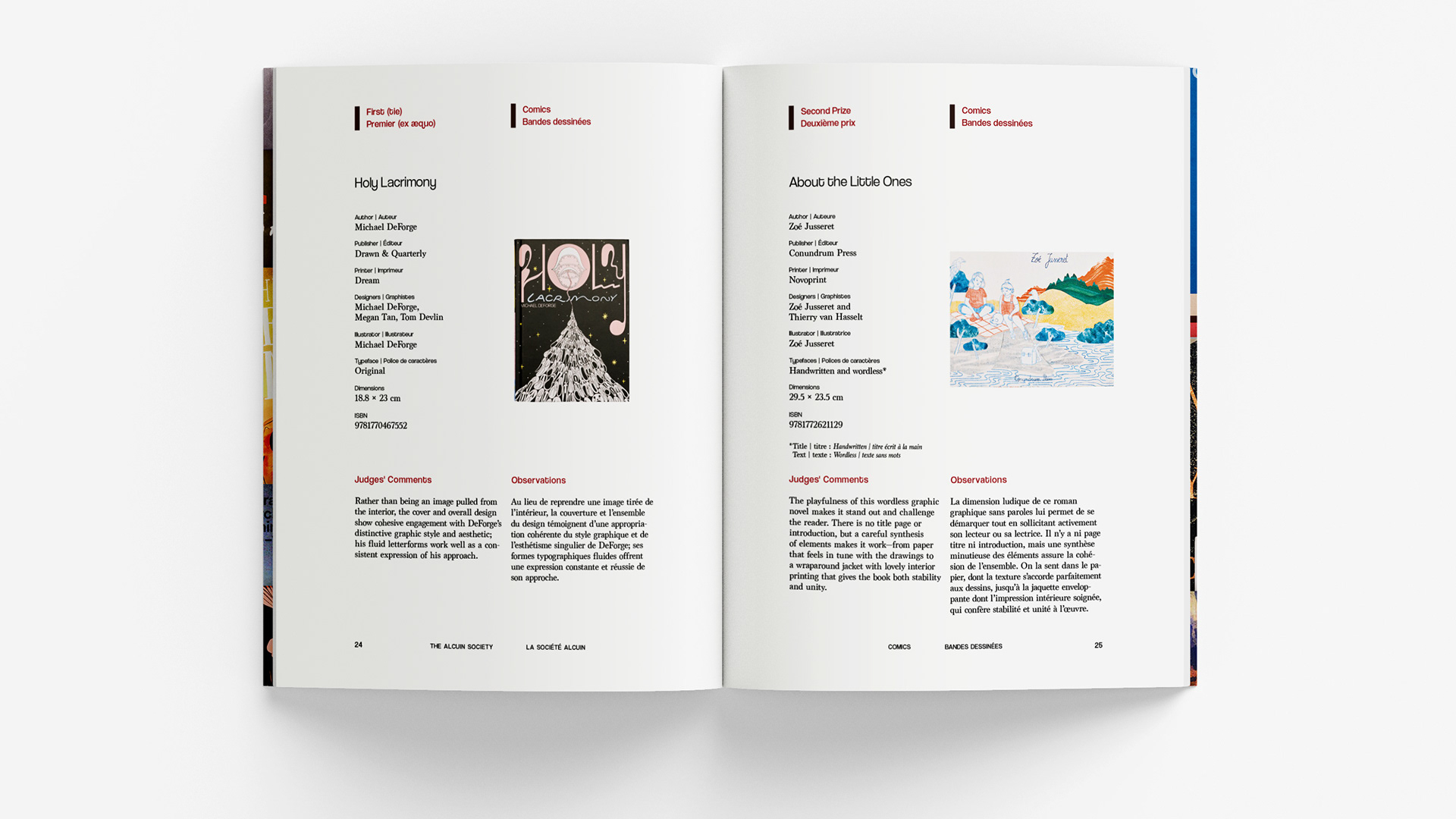
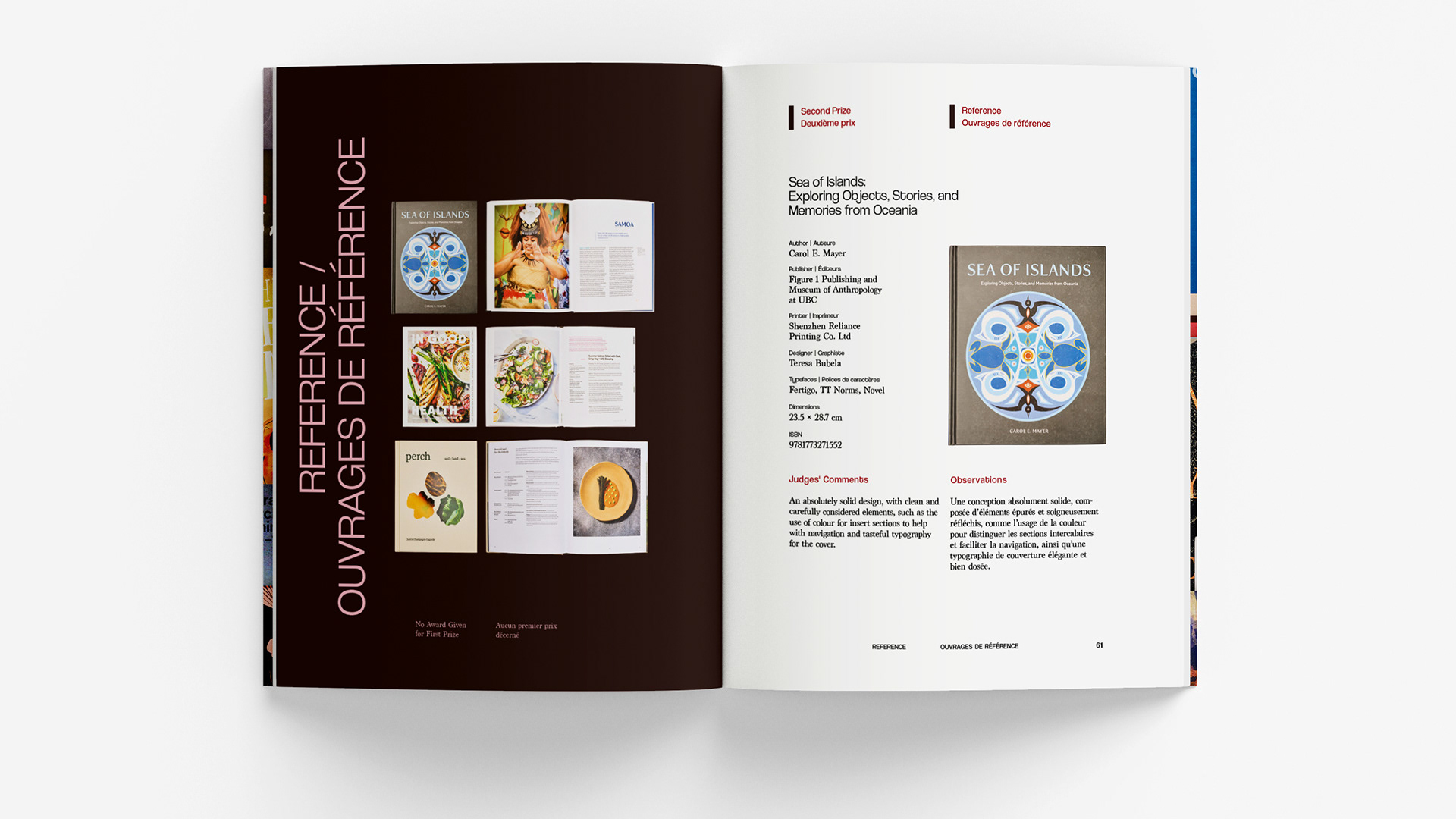
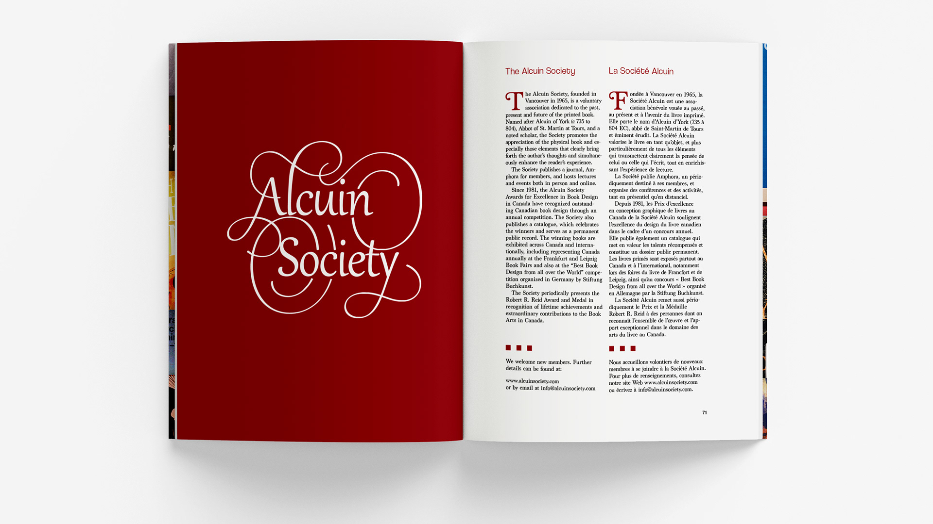
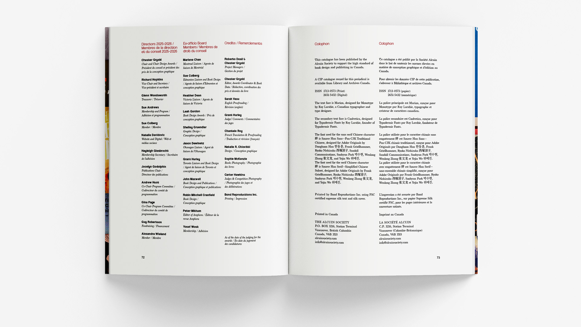
Inspired by the intent to celebrate Canadian book design, I use typefaces designed by a Canadian type designer Ray Larabie. I chose to use serif and sans-serif typefaces including Marion (Monotype) and Coolvetica (Typodermic Fonts). I used The Alcuin Society’s signature red alongside rich brown and light powder pink to combine deep earthy warmth with soft playful contrast, for a look that is both grounded and creative. As a navigational feature throughout the catalogue, I use thumbnail-inspired section dividers, Gutenberg-style margins, and bold typography. Further, an infographic calls attention to the 35 designers, 33 books, 26 publishers, and 6 provinces across Canada included in this year’s awards. Visually, I use scale, colour, and pattern of design elements such as stamp-effect images and collages to celebrate The Alcuin Society’s evolving publishing and design directions.
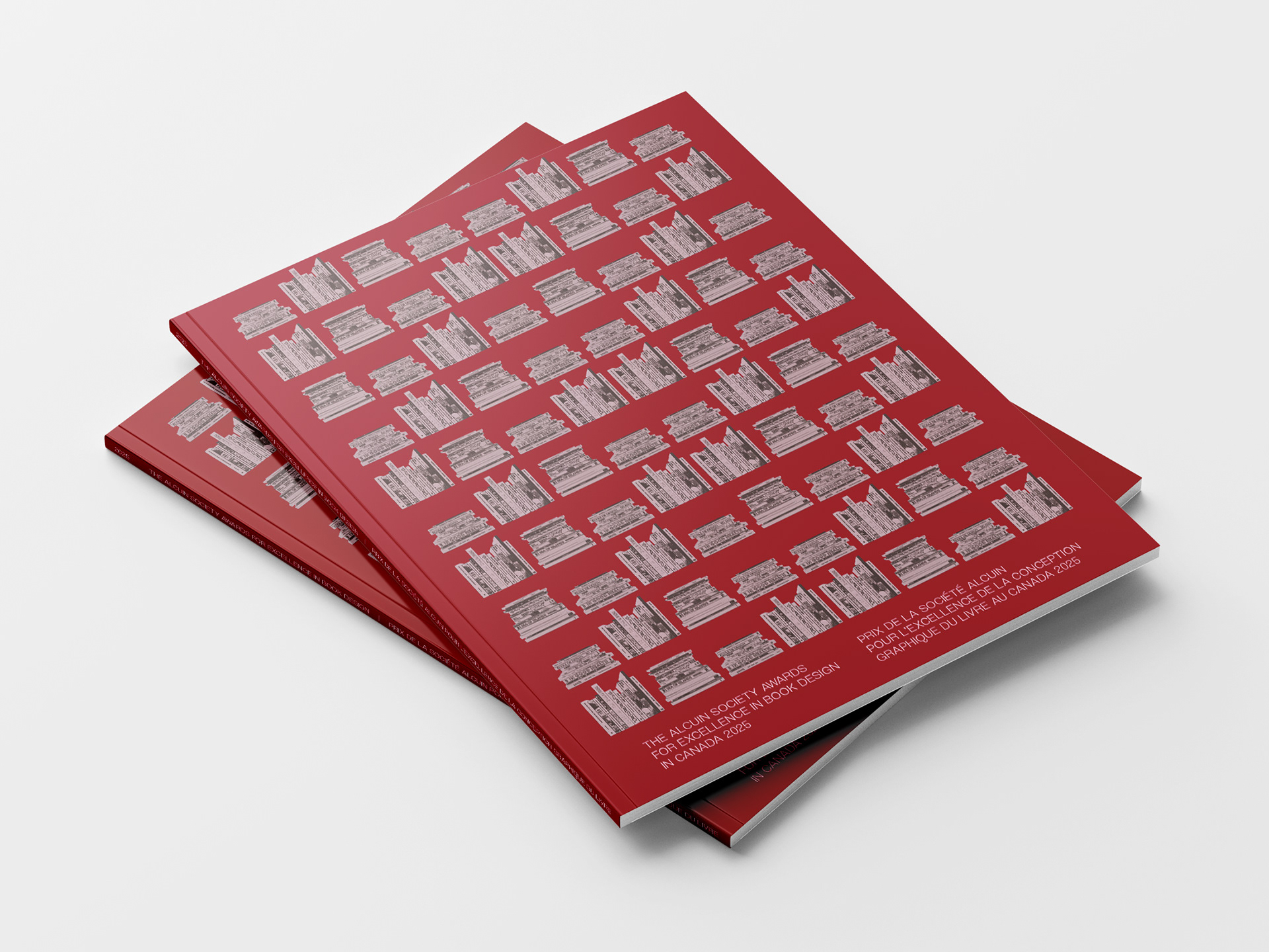
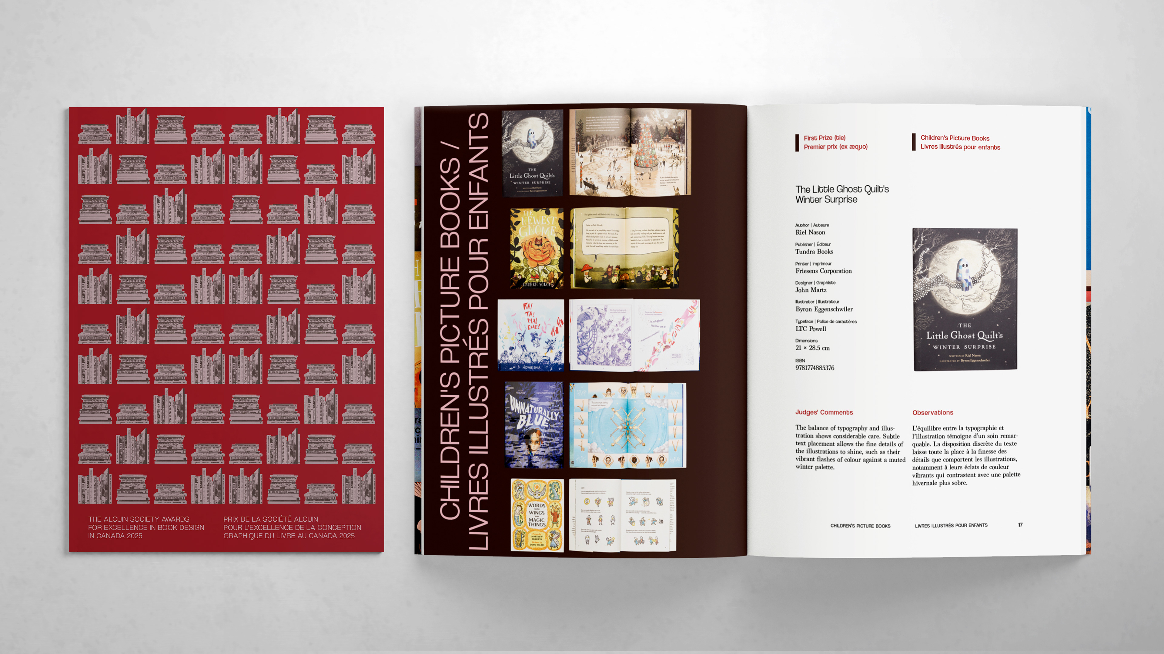
Sample Pages
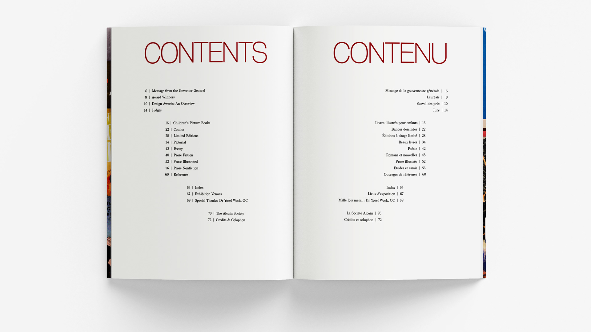
2024 Catalogue
Published August 2025
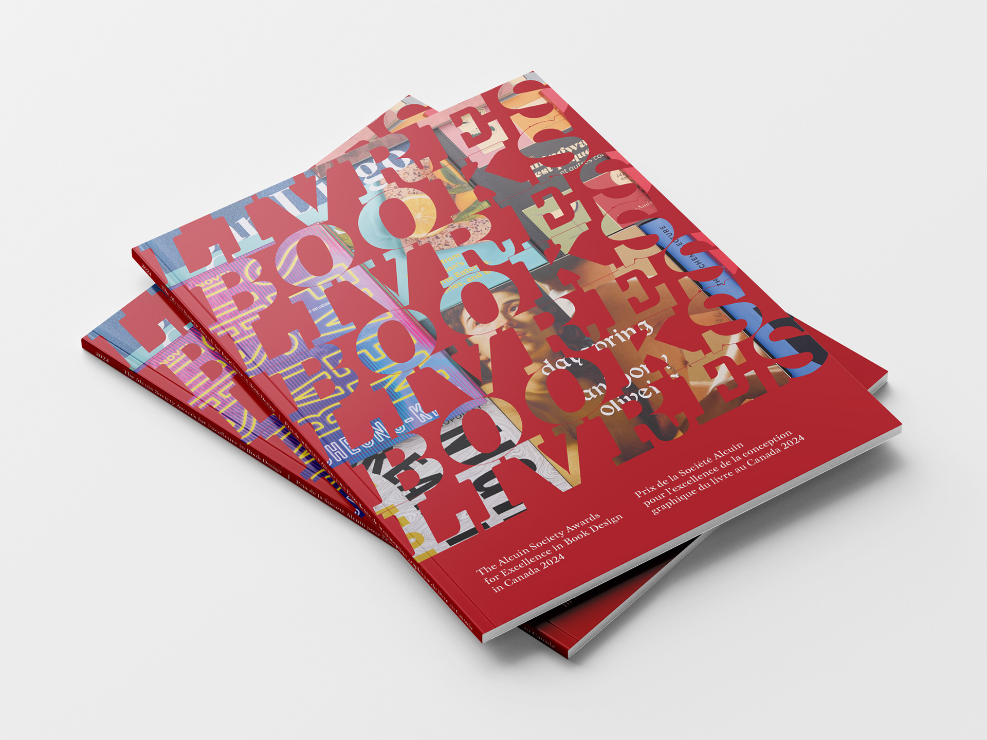
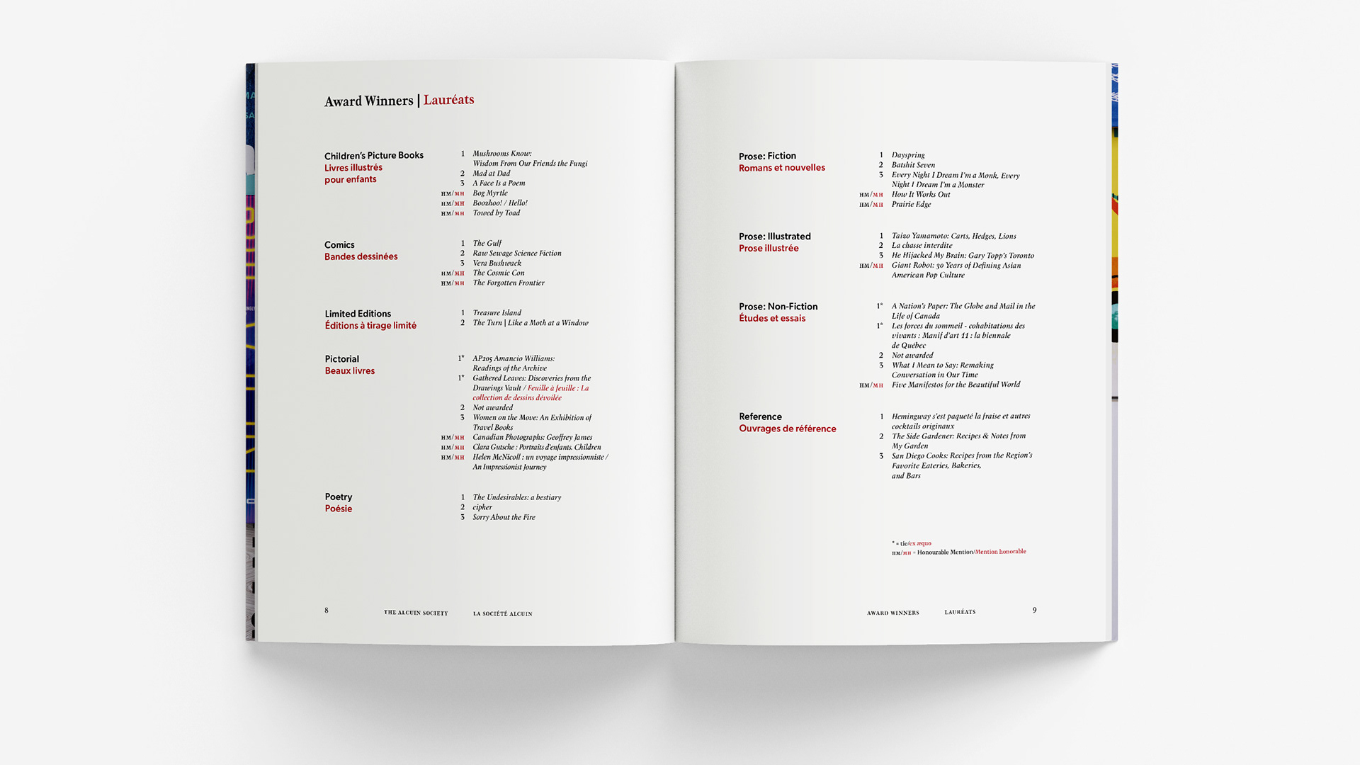
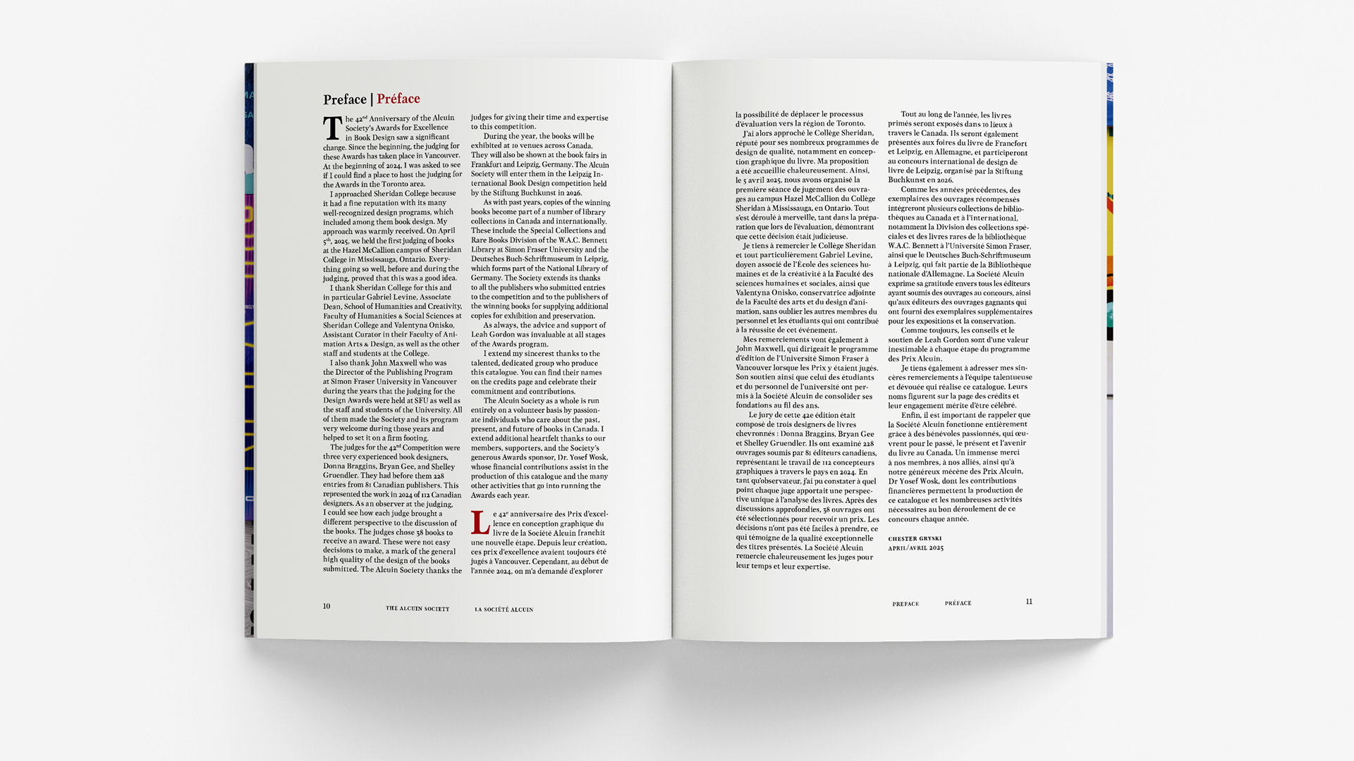
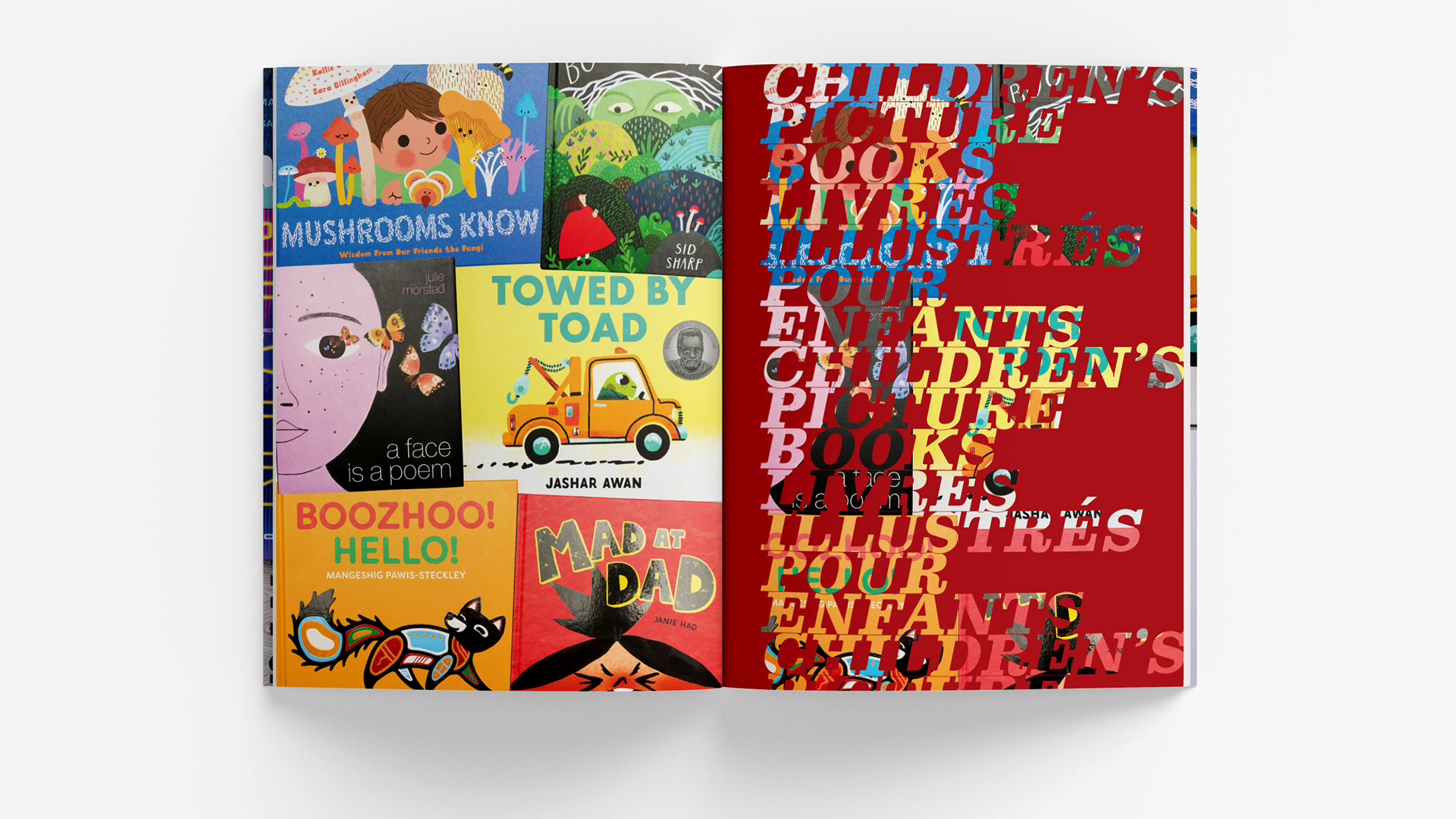
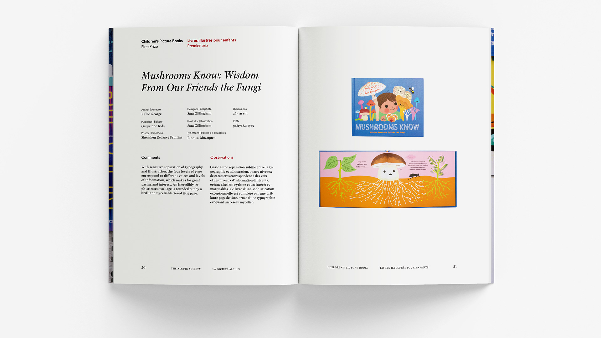
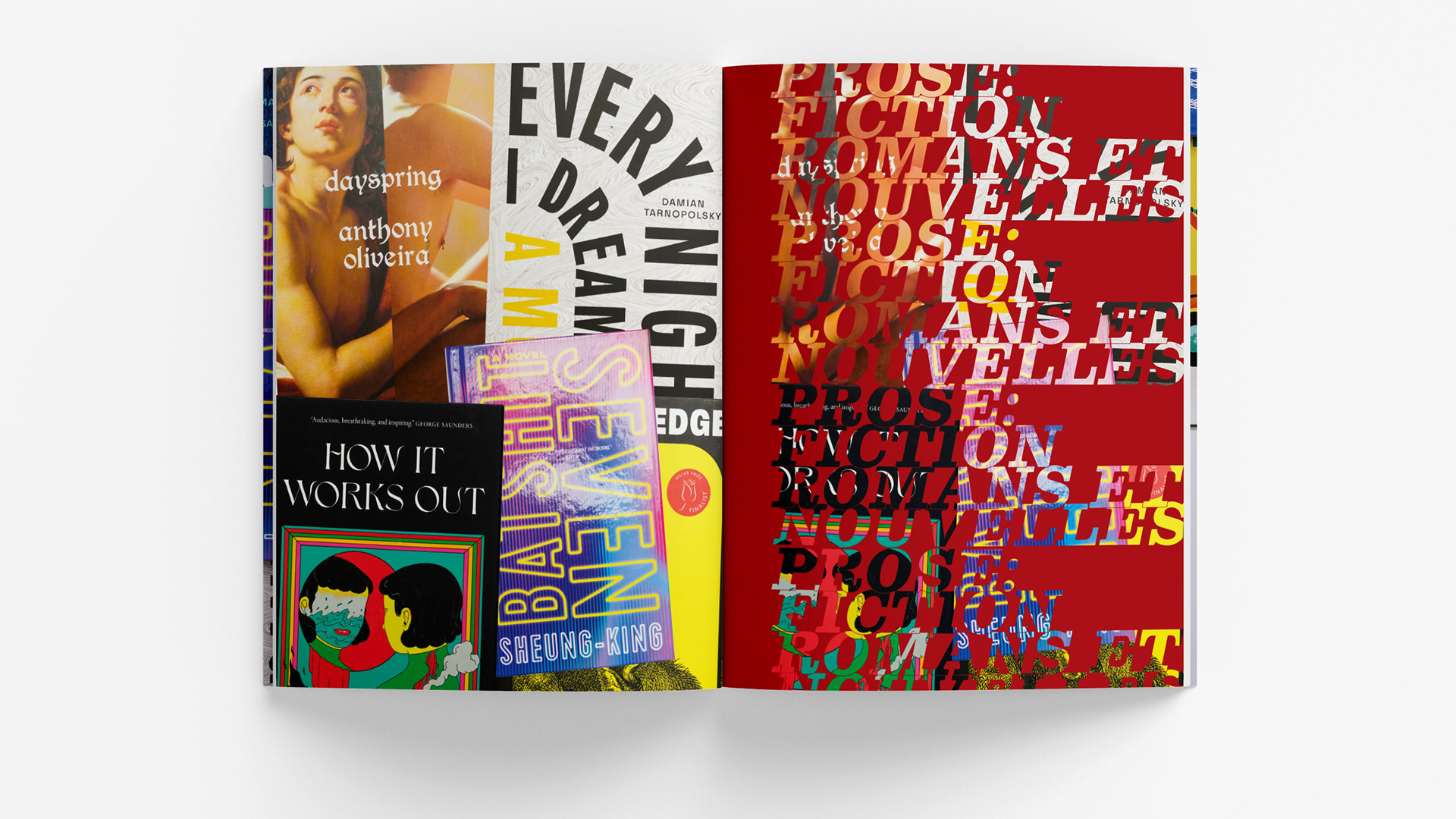
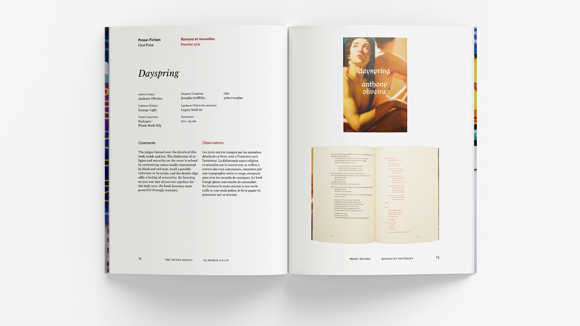
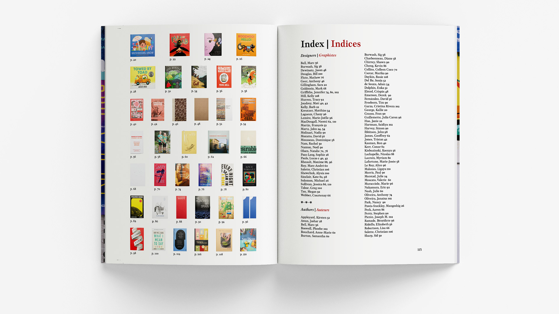
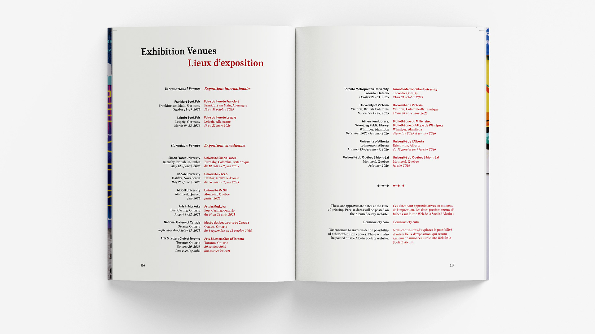
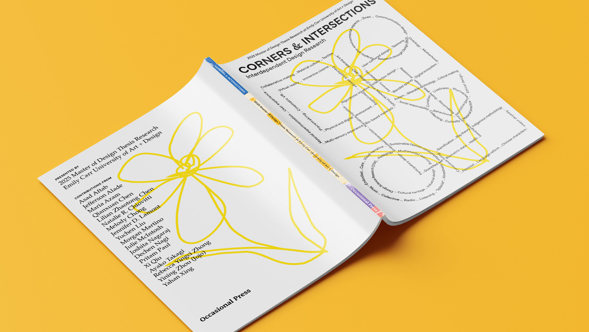
To echo the beginnings of book production and print culture together with contemporary design, I feature The Society’s signature red colour, Gutenberg-style margins, fleuron glyphs, drop caps, and small capitals. Visually, I use scale and pattern of design elements such as full-bleed images, collages, and an image-in-text typographic effect to celebrate The Society’s evolving publishing and design directions. Inspired by the intent to celebrate Canadian book design, I decided to use typefaces designed by Canadian type designers and/or foundries. I chose to use serif and sans-serif typefaces including Mauritius, Gibson, and Clarendon Pro Text released by Canada Type.
Sample Pages