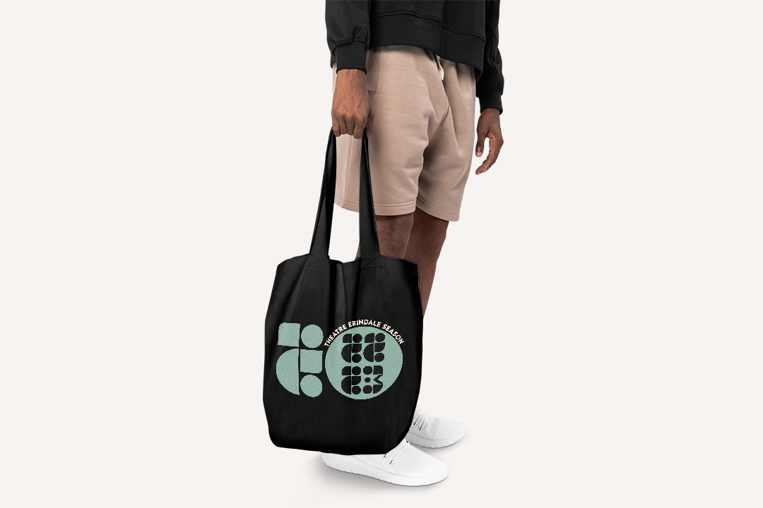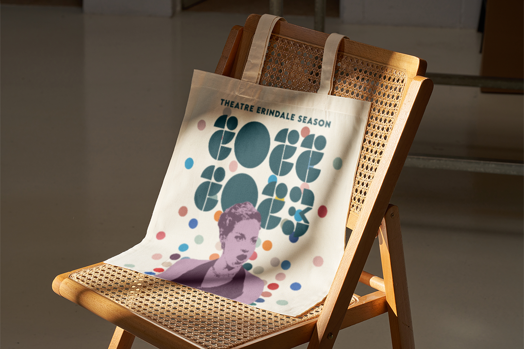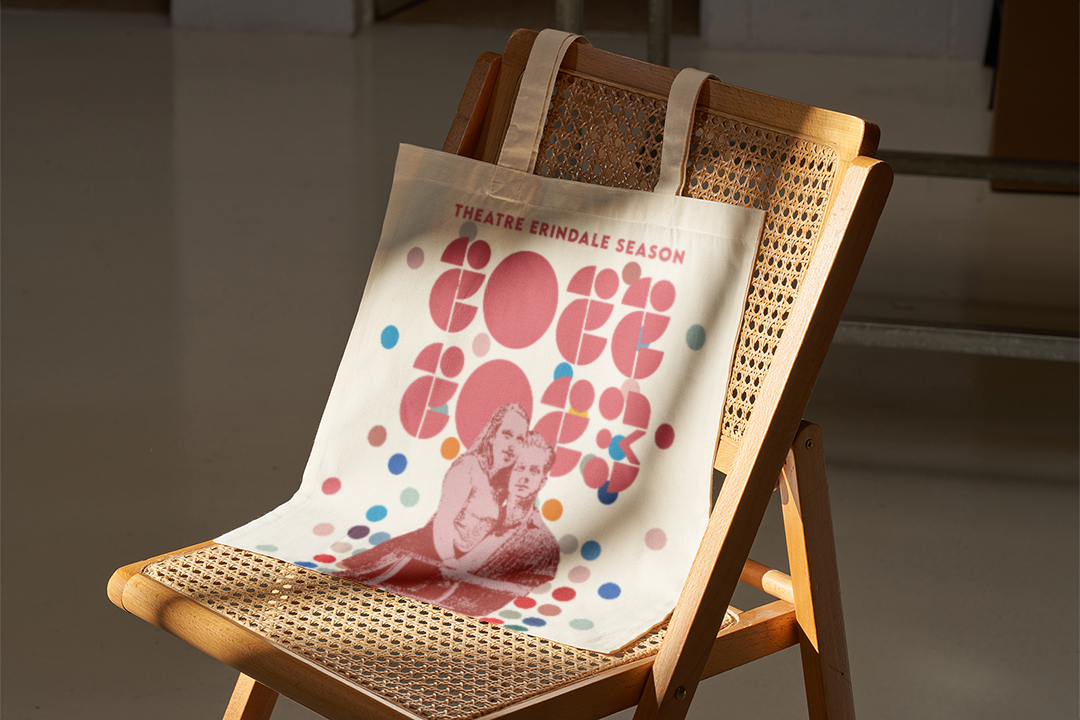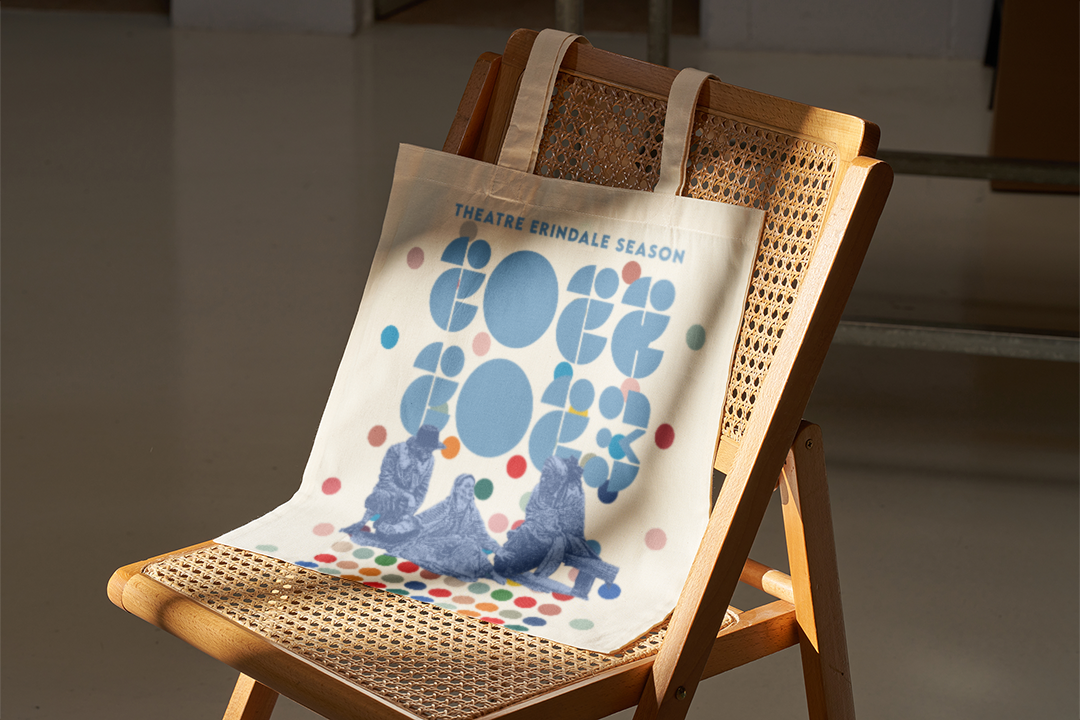
Theatre Erindale 22/23 Season
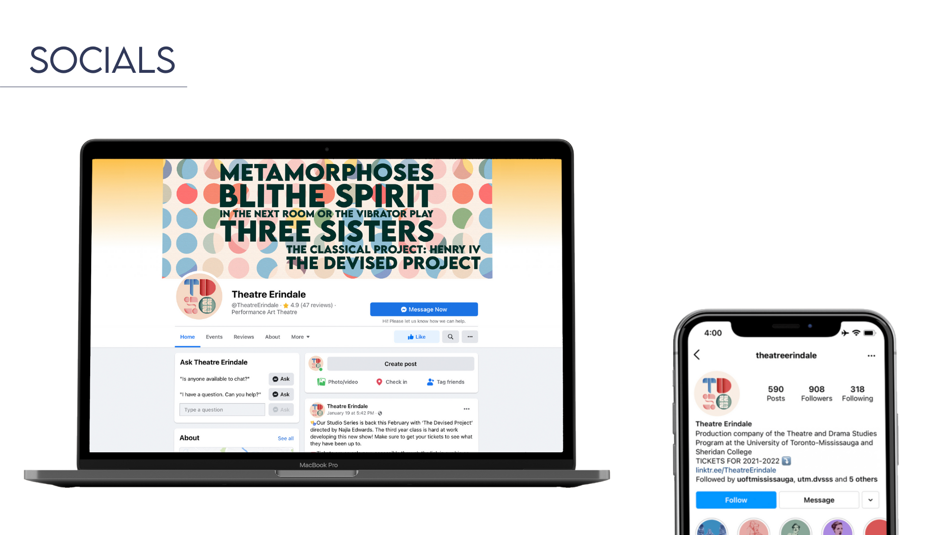
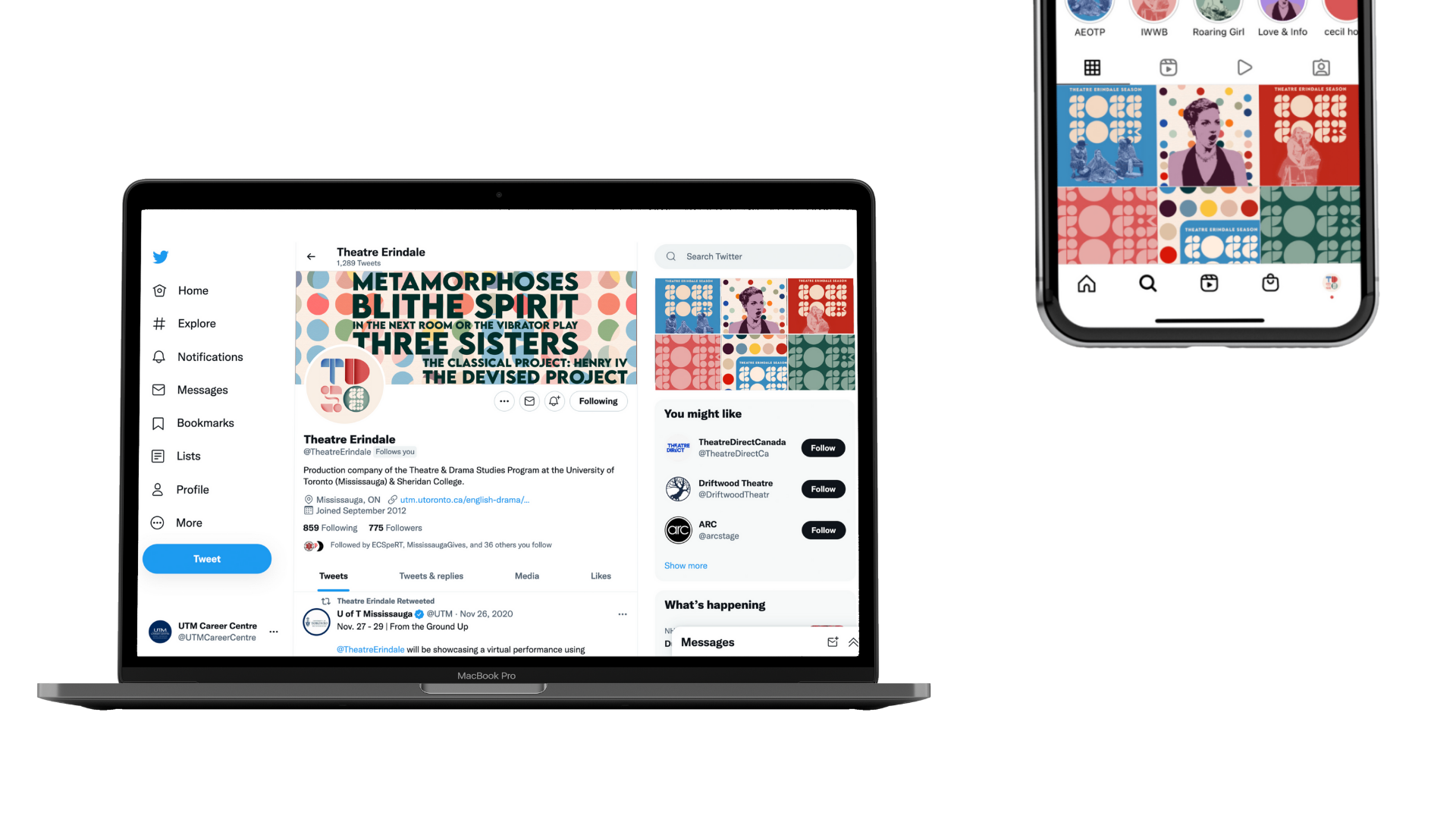
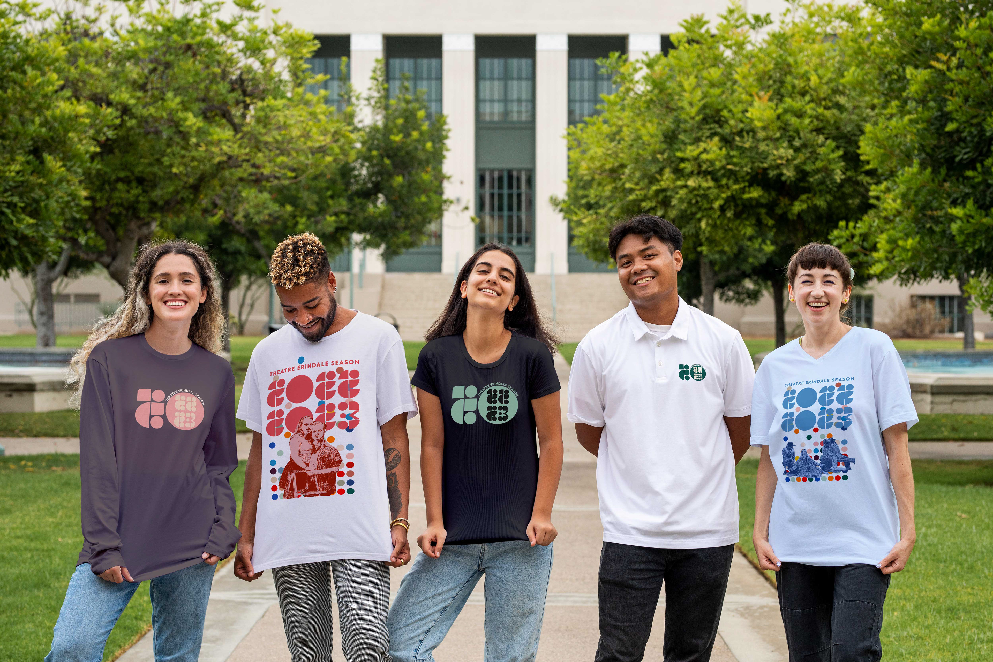
Brand Identity: Logo, custom typography, theatre programme, print advertisements, social media content, and apparel
Project Type: Client-based student project, independent
Role: Graphic Designer & Art Direction
Tools: Adobe Illustrator, Photoshop, InDesign & photo archive from client
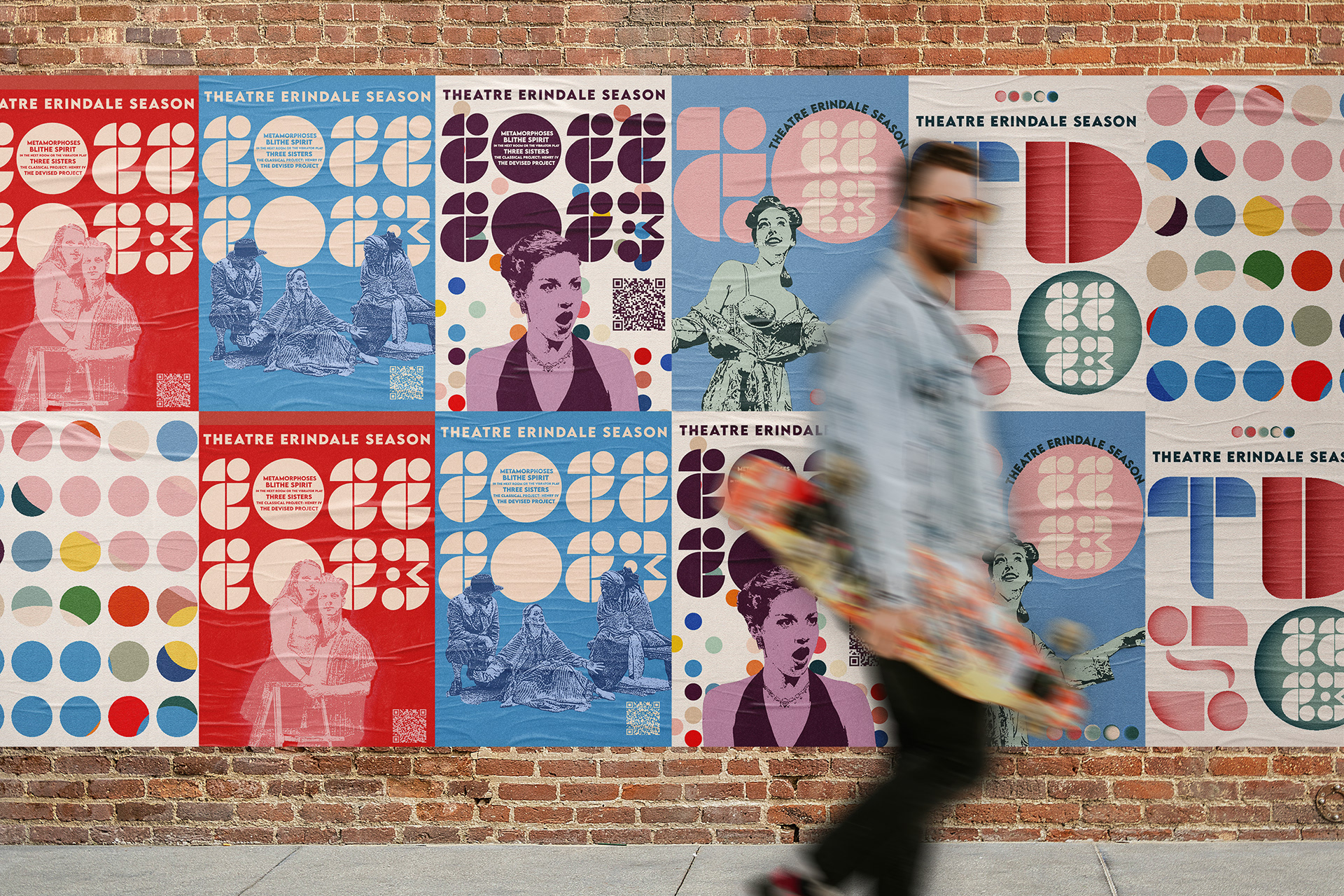
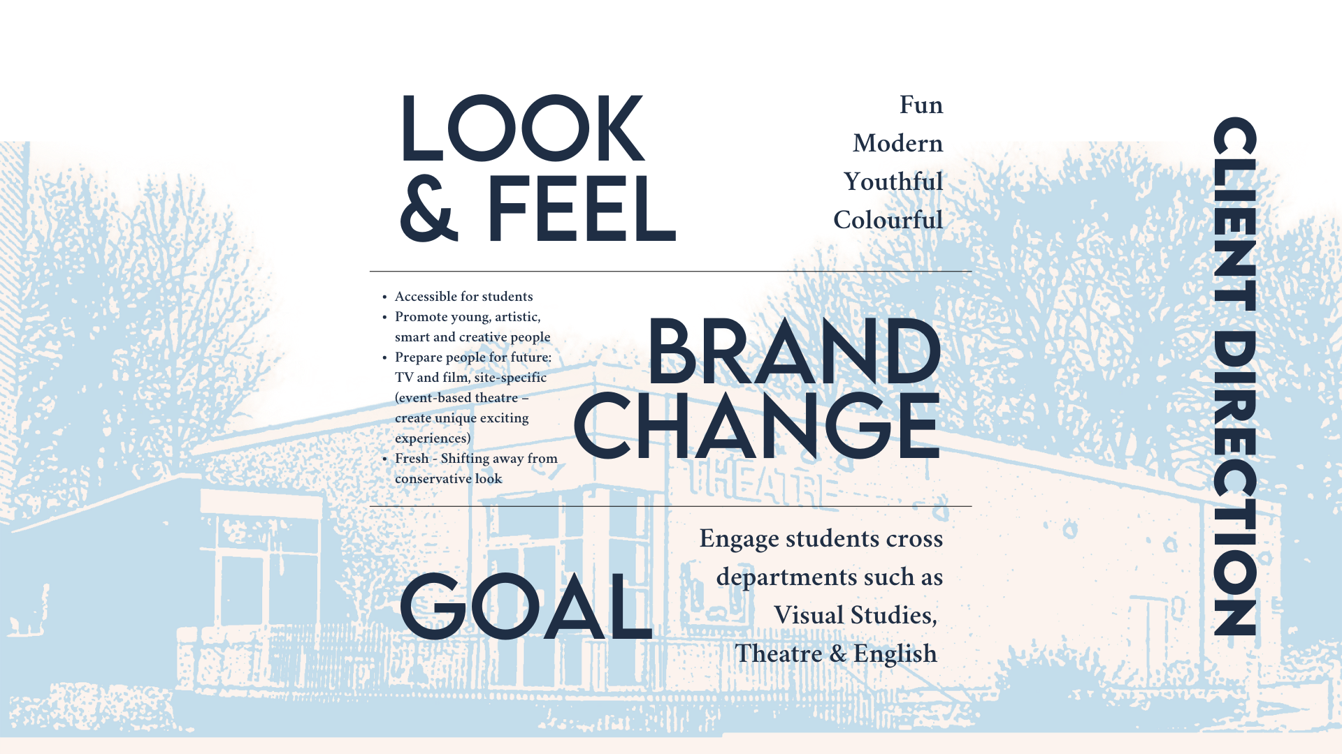
The client for this school project was Theatre Erindale in the Department of English and Drama at the University of Toronto Mississauga (UTM). Their desired target audience for this project was university/college students: 18-24 years old. The key challenges that characterized my design brief were to: 1. reinvent the look and feel of Theatre Erindale; 2. move towards a fun and modern look, away from a conservative image; and, 3. pitch a brand change that is accessible to students and communicates a sense of community among artistic and creative people.
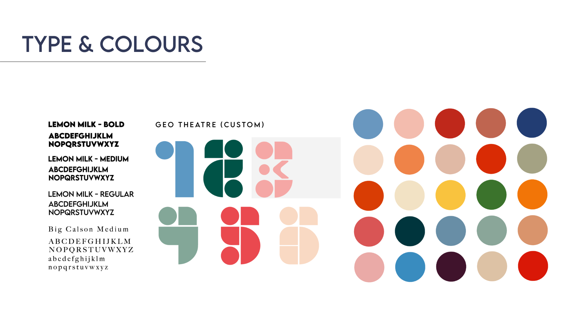
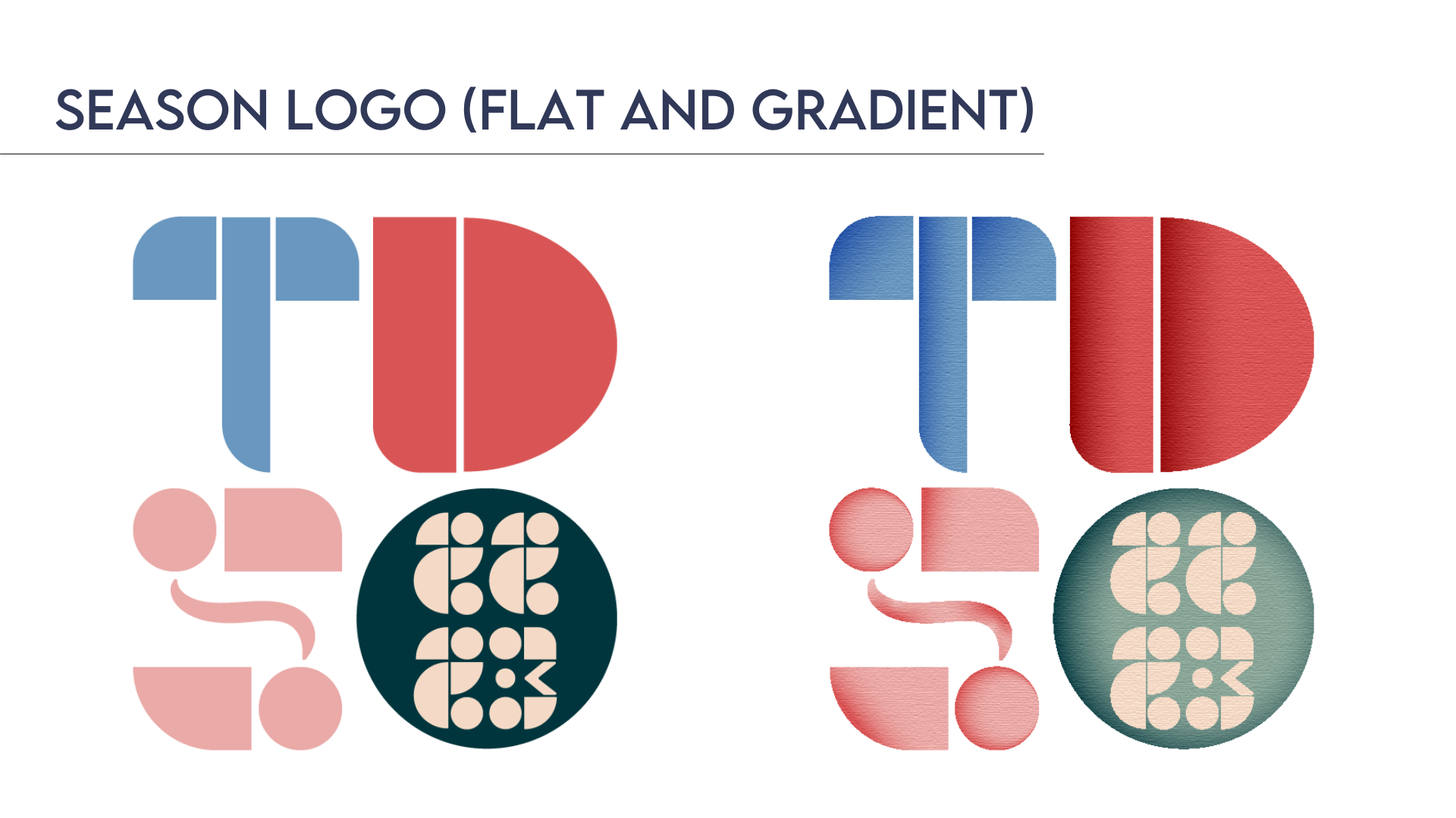
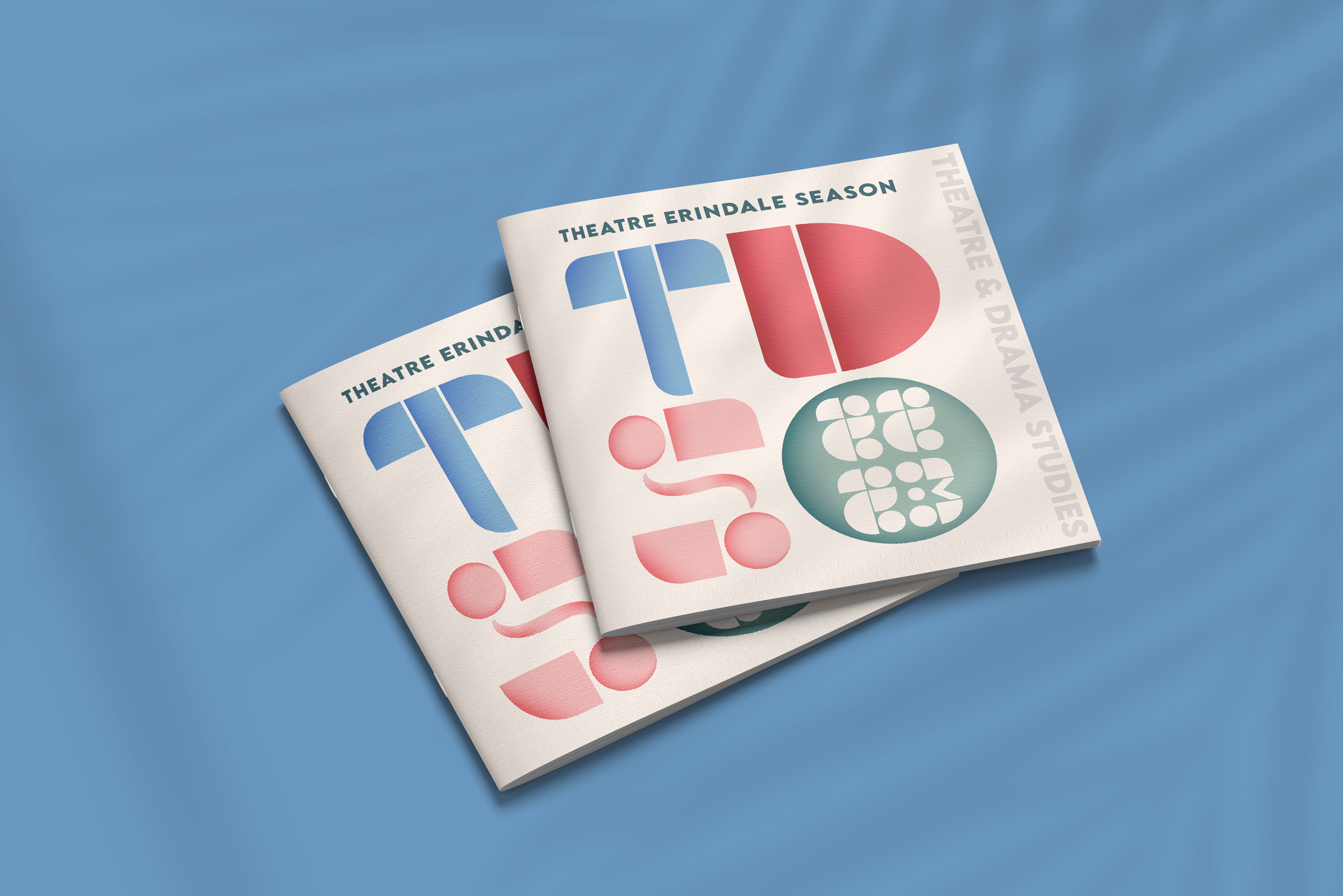
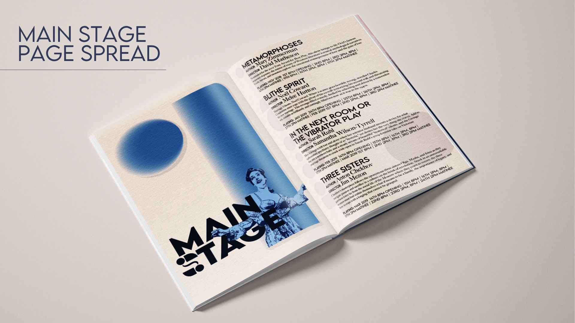
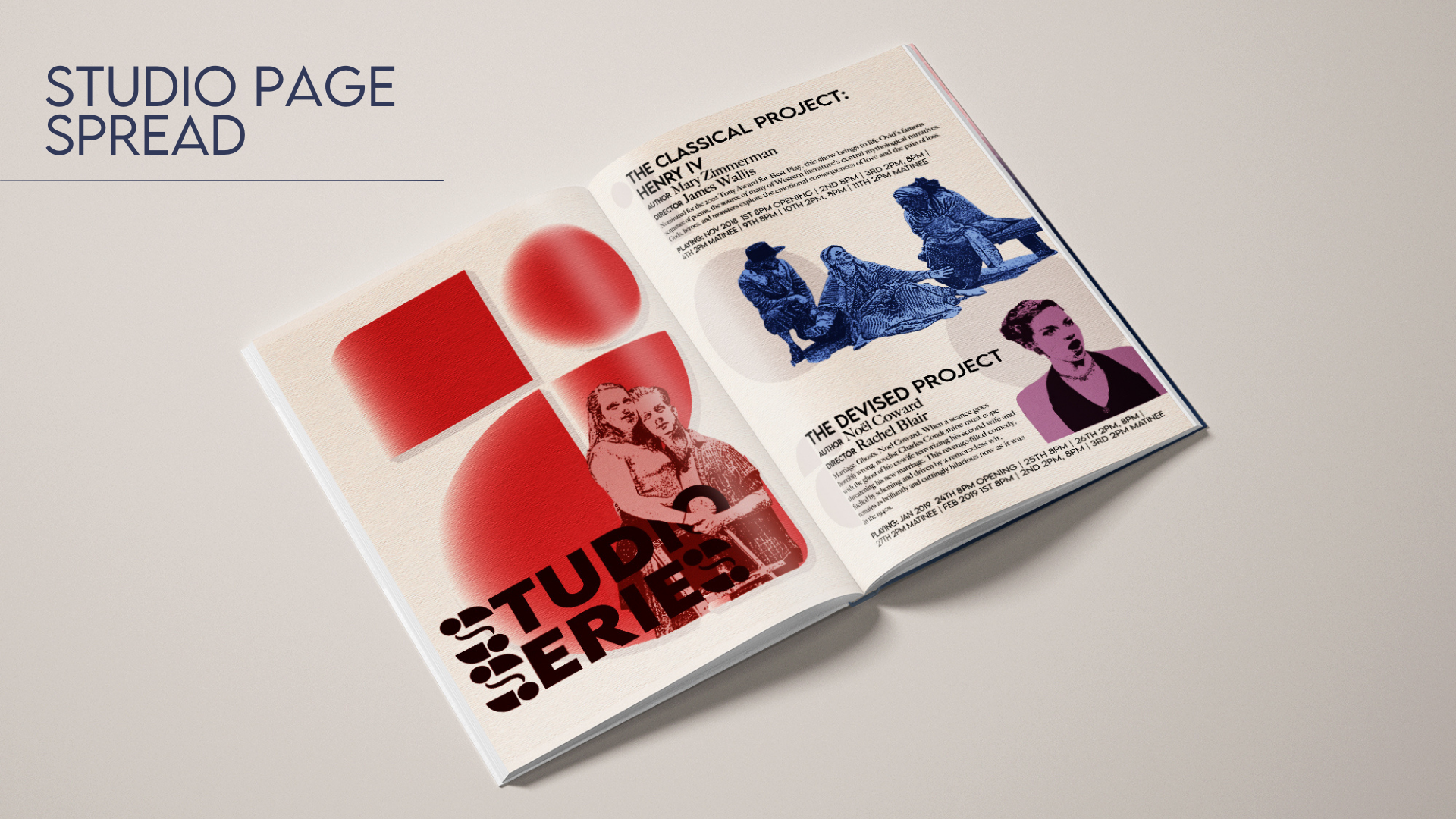
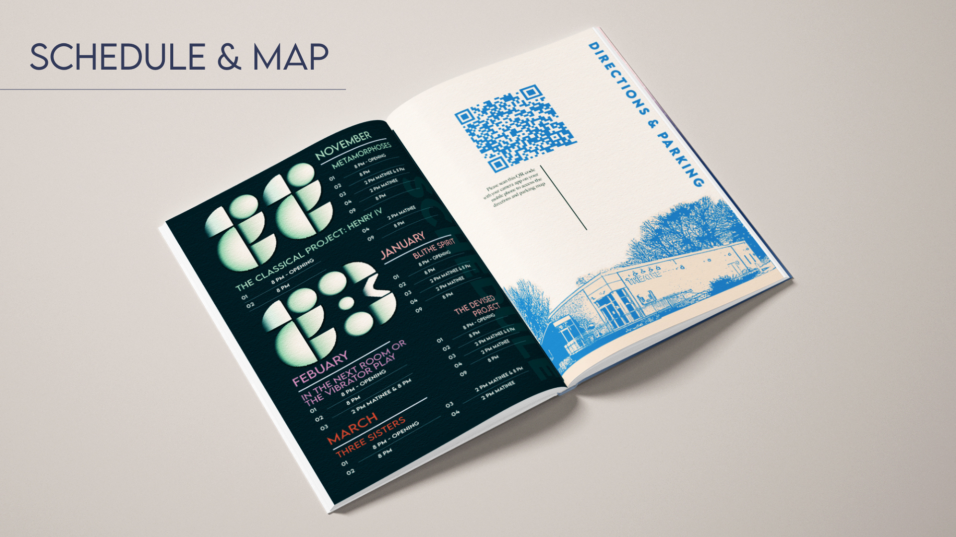
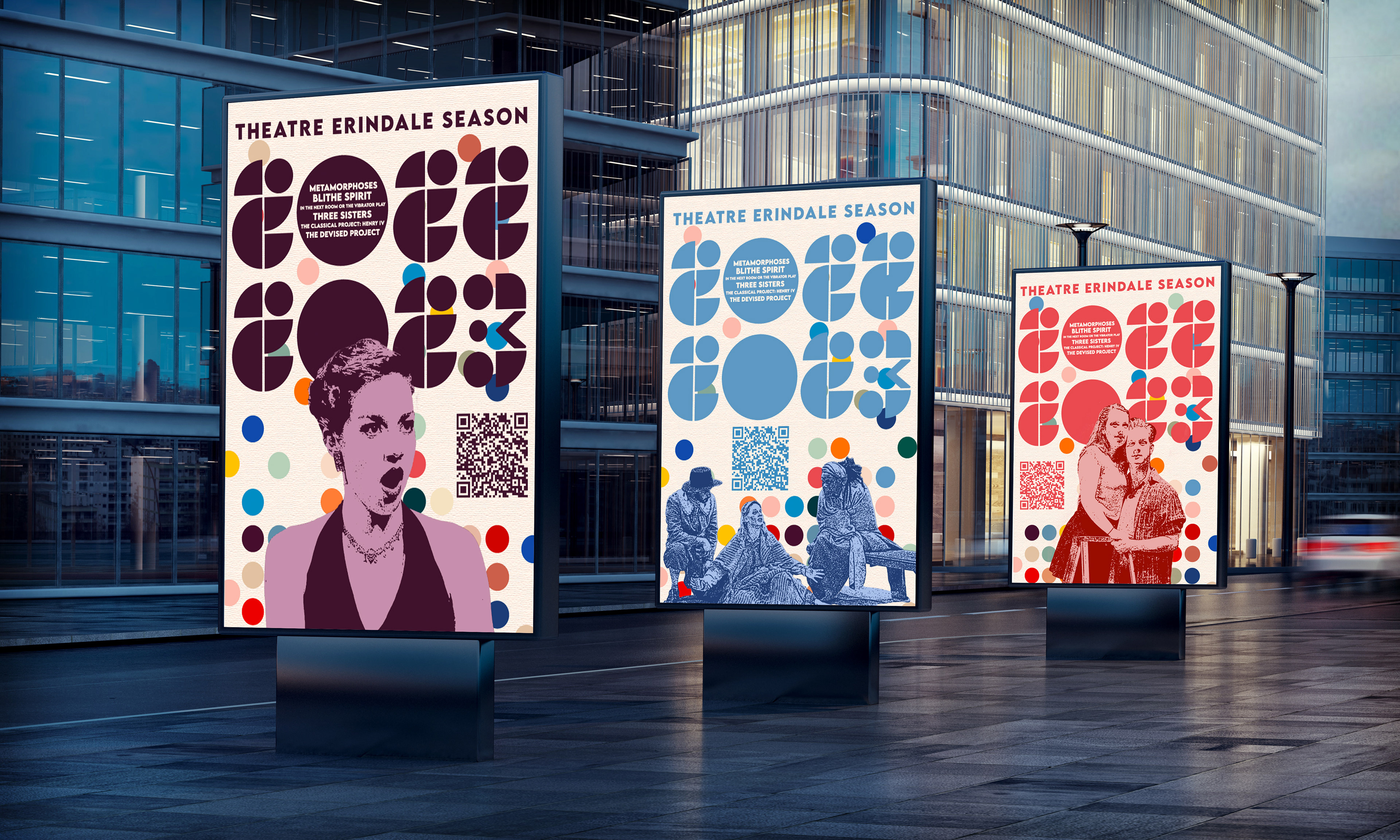
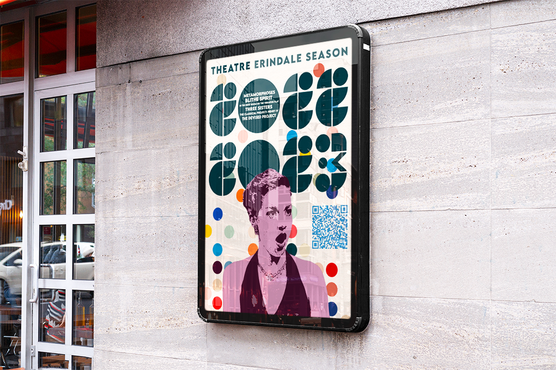
My design solution meets both Theatre Erindale’s desired look and feel by encompassing both a modern aesthetic and a vintage aesthetic. The design is a balance of a vibrant colour palette, custom geometric numbers, and stamp-like illustrations of student actors/actresses. I made each of these stamp-like illustrations from pre-existing photos provided by Theatre Erindale. The stamp-like illustrations were used to evoke a sense of timeless youthfulness and fun in the spreads for the Main Stage, Studio Series, and Schedule and Directions Pages. The stamp-like illustrations of actual student performers promote Theatre Erindale’s theatrical shows by capturing its energy.
Within my design solution I focus on elements of colour, balance, contrast, scale, negative space, shape, and pattern to enhance the desired look, and to step away from the previous conservative look that was no longer used by Theatre Erindale. Further, I included a QR code with brief instructions on the ‘Directions and Parking’ page rather than a conventional map. This is to ensure that the relevant information is accessible online for the target audience.